
Radio Times covers may not be what they were, but over in New York… (by Trina Wydmanski at Phosphor Art)
Seeing their first professional illustration always gives artists a buzz. Years ago, an over-excited fresh-faced illustrator ran into the office – this was at the time when some used to work in house. He was overexcited because he’d spotted someone on the Tube looking at his first paid-for drawing in a magazine.
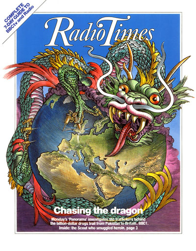
The more experienced artists took the mickey, ridiculing how the enthusiastic newcomer would react if their work had been, not in a publication, but on it. On the cover – and not just any old cover. The cover of The Radio Times.

For decades, it was arguably THE illustration gig to get in the UK. The editors had a reputation for commissioning great writing and illustration. It was, if I remember correctly, the UK’s largest circulation weekly title, not least because it had a monopoly on TV and radio listings (latterly shared with TV Times) prior to deregulation. Books are dedicated to its history. You can buy boxed sets of postcards showing the images. Our scraperboard artist Bill Sanderson produced several covers for them over the years.
I scanned the hundreds of magazines on the newsagent's shelves as best I could. The majority of them were niche if not downright obscure. There were so many they couldn’t be properly displayed, so it was difficult for any cover to grab the casual buyer's attention. The Radio Times was there, still with its obsolete name. But a mere shadow of its former self – and using photography. Out of several hundred, only a couple had cover illustrations. The Oldie (which regularly features work by our legendary Bob Wilson on its front), The Spectator and Time were flying the flag for illustration. These last two regularly feature cartoon or cartoon-like covers to make a point that a photograph couldn’t.
I didn’t spot New Scientist or The Economist which deserve honourable mentions for commissioning cover art. At weekends there are regularly illustrations on the front of the national press supplements, but they are tucked away inside the newspaper. I was thinking that nothing comes close to the past revered status of The Radio Times… then I remembered.
There is one publication that reigns supreme in this field. If I’d been in a more cosmopolitan newsagent, it would have been there. Since 1925 its cover has carried its title, its issue date, its price and an illustration. That’s it. No headlines, no sub-headlines.

I’m talking about The New Yorker. Each of its more than 4,000 covers is a piece of social history for the thinking classes of that city at any particular moment. It might feature a piece of whimsy, or something on the collective mind like the Holidays, the weather or even 9/11.
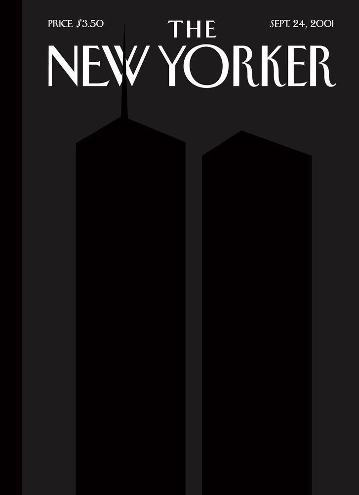
In 2005, the American Society of Magazine Editors selected the 100 best magazine covers of the past 40 years. At Number 6 was the chillingly sombre cover of The New Yorker’s first issue following 9/11. Inspired by Ad Reinhart’s black-on-black paintings and created by Art Spiegelman (the genius who later published the graphic novel Maus) and Françoise Mouly, its image of shadowy Twin Towers that could only be seen from certain angles captured the mood in the devastated city.
Incidentally, of the top 20 covers, four carried illustrations (three New Yorker’s, one from Time), one was typographic, the rest photographs. The highest NY entry was Steinberg’s famous 1976 drawing satirising certain Manhattanites’ self-centred view of the world. Read about it here.
The New Yorker’s detractors (who may well have an orange hue and hilarious hair) accuse it of being metropolitan elitist, smug and self-reverential. And indeed, every year close to its anniversary it re-runs the cover from its first issue or a new take on it. March 6th’s issue saw Barry Blitt illustrate Putin looking up at Trump as a butterfly, referencing once again Rea Irvin’s stylish dandy Eustace Tilley. (Putting New Yorker and the artist’s name in Cyrillic script are neat touches.)
Consumers judge magazines – and often books – by their covers. And illustrations can be so much more effective than photographs in grabbing attention and creating atmosphere.
No one realises this more than The New Yorker and no one does it better or has stuck as doggedly to its belief. It is a powerful brand icon, building in weekly parts. May it continue for at least another 92 years.
(This article was originally published by Trina Wydmanski, managing director of Phosphor Art Ltd on LinkedIn)