The SAA are very pleased to be supporting the World Illustration Awards by sponsoring The SAA Agents Award for New Talent.

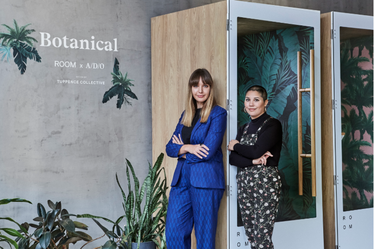
Botanical Booths | Alicia Perry and Rebecca Intavarant for ROOM

Design duo Alicia Perry and Rebecca Intavarant - founders of Tuppence Collective - collaborated with New York-based startup ROOM to create custom designs for their limited edition Room One booths - a reimagined working space for the modern world.

Described as ‘the future of work’ and based on the a phone booth design - the booths fuse creativity and functionality to provide a private, soundproof space to work in or take calls. Through the effective use of space, they are designed to create a quiet place to breathe and think out loud within the working environment.

Tuppence Collective, the north London-based surface design studio, design and hand-paint original patterns inspired by beautiful botanicals and modern designs.

Alicia and Rebecca work together in the studio, splitting each project 50/50. They sketch their designs then paint them in acryllic together so each piece has a blend of both artists’ styles. The designs are cut out and layered onto different coloured backgrounds.

These striking patterns inspired by the natural world were the perfect fit for ROOM who wanted to create a stimulating environment within the booths whilst giving a sense of tranquility in the workplace. The duo had lots of ideas to meet the brief.

“Whenever we create a design, we’re always conscious that we want our work to appeal to both men and women. Our focus has always been on botanicals, as we wanted to show that floral doesn’t have to mean feminine. We try not to be influenced by current trends, since our aim is to create designs that are timeless.

“For inspiration, we tend to look back to the arts and crafts movement but also incorporate brighter colors and tropical foliage for a more modern feel. This way, we combine the essence of old and new, much like what ROOM is doing by giving the classic phone booth a modern twist. All of our designs are hand-painted for a more traditional yet illustrative feel.

“Our pattern design for the booths is meant to truly transport employees to a place of relaxation. The booths allow creativity to flourish by providing privacy and inspiration to the modern worker.”

The final designs were printed onto fabric and applied to the walls of the booths to create the limited edition, three-piece Botanical collection.

The launch event for the collection was held at A/D/O - a Brooklyn-based creative hub built for designers and open for all. The booths will be available for public use throughout January to provide guests with the private spaces they need for phone calls and focused work.

ROOM custom designed the Botanical colleciton with the A/D/O community in mind, to make room for creative exchange and effective collaboration, and the bright, open-plan space was the perfect place to first showcase the booths.

All photos courtesy of ROOM.

A/D/O were delighted with the end result and the developed functionality of their space. They said: “As a public space that fosters a creative community, we are thrilled that we can now offer a private space for guests to take important calls. ROOM has brought the future of work to A/D/O.

Behind the Book: Santa Claus vs The Easter Bunny by Fred Blunt

To kick-off the Christmas season, we’ve gone behind-the-scenes of Fred Blunt’s new author illustrated picture book ‘Santa Claus vs The Easter Bunny’, published by Andersen Press. A fun, festive revenge tale — of the chocolatey kind — which pits the scheming Easter Bunny against the jovial, and completely unaware, Santa Claus with mounting hilarity.

Fred tells us about his creative process, how he created the two loveable characters at the heart of the tale, and how he builds humour into his artwork through fun narrative details.

‘Santa Claus Vs The Easter Bunny’ is a brilliantly fun, festive tale, what first sparked the idea for your story?

It was a simple drawing of the Easter Bunny picking up a milk bottle from his doorstep, with Santa saying hello to him next door. No idea why I drew it, but funnily enough that scene ended up being the opening spread of the book. After that the story told itself.

Can you tell us about how you created your artwork for ‘Santa Claus vs The Easter Bunny’? Does your creative process ever differ from book to book?

The art for this book was created digitally, by scanning in line work and coloured areas, arranging them over rough guides on screen. It’s a bit like creating a silk screen print, but on screen (monitor screen). It was quite a laborious process to be honest, but I wanted to get a hand drawn feel, but with the kind of zing you only get with digital colour. I try to approach each book differently, depending on the story, feel and characters. Some books are more line orientated, where this book was more about limited flat colour, and reduced line work — in the hope of a bright fun feel. I always try hard to keep the personality and spontaneity of the initial sketches, through to final artwork, no matter what approach I take.


What is your favourite spread in the book, and why?

I quite like the spread where Bunny is filling the Merry Manufacturing machines with warm liquid chocolate! It was fun drawing the ridiculous factory machines and challenging to create the night time atmosphere with the limited palette. Also, Bunny is so fun to draw when he is being wicked!

Comedy is a key component of a Fred Blunt book, how do you create humour in your artwork?

There are lots of ways of injecting humour, from little details that hopefully get noticed by the kids — like the chocolate coming out of the machine, looking like a dog poo! Also details that parents reading might enjoy, like having Sir Trevor McDonald make a cameo! But most of the humour comes from the interaction between the characters. I like to think of the characters as actors and they hopefully tell the story in a humorous way with their expressions and body language.

Santa Claus and The Easter Bunny are both well-known fictitious characters, how did you go about putting your own spin on them?

Fictitious! What do you mean? I’m not sure really . . . the very first Bunny I drew was wearing a roll neck sweater, which seemed right somehow. As the story developed he started wearing paisley smoking jackets and he would sit in 1960’s style egg chairs, for no other reason than it felt right. I also didn’t feel that he should be a normal bunny, so he became more of a bunny man for some reason. With Santa I wanted to make him the most roly-poly Santa imaginable and I think he could be a contender for most rotund Santa to feature in a picture book? In my head Santa talks like Brian Blessed, all over the top shouty exuberance, which becomes apparent in his body language and expressions. The Nordic pattern on the suit was an attempt to make him stand out from all the other Santas out there. The characters didn’t really change that much from the very first scribbles. I think first instincts can be the best ones.

What one piece of advice would you give to an aspiring picture book author / illustrator?

Be true to yourself. Tell stories that come from you — don’t try to make generic books that fit in, because ultimately they will be dull.

Fred brings ‘Santa Claus Vs The Easter Bunny’ to Seven Stories for a live-reading and drawing event

What are you currently working on? Can you tell us about your next upcoming title?

I’m poised, ready to start work on a picture book, written by a really great author — really exciting stuff, that I can’t mention for the moment. My next author illustrated book will be called Gnome and published by the amazing Andersen Press again. Oh, and I’m working on some animation development at the moment too, with my friend and collaborator Michelle Robinson, which fingers crossed will see the light of day at some point.

You can view more of Fred’s artwork here.

Get in touch with Fred’s agent Arabella.


How Winston Delivered Christmas by Alex T. Smith

Deck the halls, buff your baubles and whack another batch of mince pies in the oven because we have the most festive of Christmas treats for you! Presenting the MUST HAVE Christmas book of the year, How Winston Delivered Christmas by our very own Alex T Smith , published by Macmillan Children’s Books. 

(more…)

Alexander Jackson for Scottish Field Magazine

Phosphor Art's Alexander Jackson continues his portrait series for Scottish Field magazine, most recently with a portrait of Billy Connolly.
Alexander is commissioned by the magazine to create stand-out portraits in his signature style... here are a few of his recent illustrations...
See more of Alexander's portraits in his portfolio.

Mandy Millie Flockton’s French Hens

Phosphor Art's Christmas card was illustrated by Mandy Millie Flockton this year. As well as being a brilliant illustrator of delightful children's books, Mandy creates accomplished pastiches of many styles.
The three French hens she illustrated for the card were inspired by her love of hand-coloured Victorian etchings and James Audubon's exquisite bird illustrations.
Find more of Mandy's work in her portfolio and the Pastiche portfolio on Phosphor's website.

Natalia Zaratiegui – Yellow Jacket Press

Natalia Zaratiegui worked with the design team at Yellow Jacket Press to create this striking cover for Skylark and Wallflower by Anne O'Brien Carelli. Natalia's timeless style was the perfect choice for this middle grade novel that alternates between war time and the present day.

Natalia Zaratiegui is represented by Meiklejohn

Join the Society of Artist’s agents

but before you do, please read our criteria for joining here