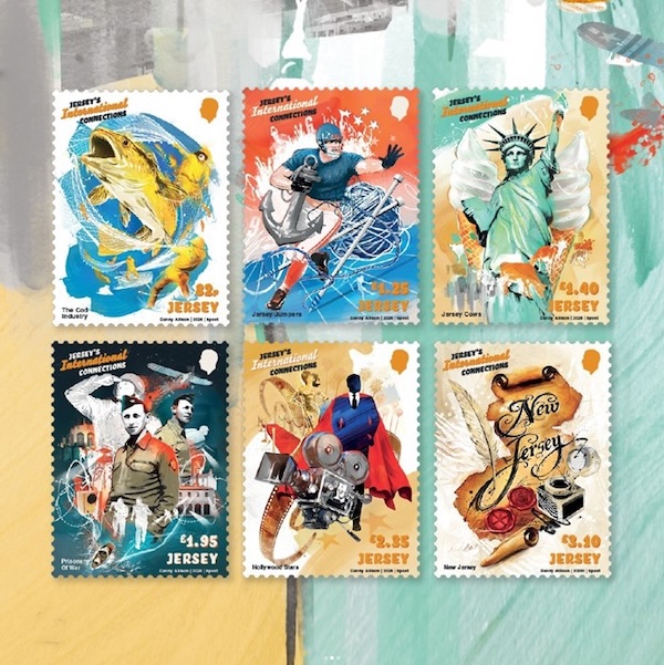
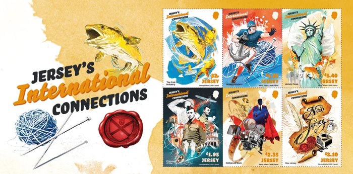
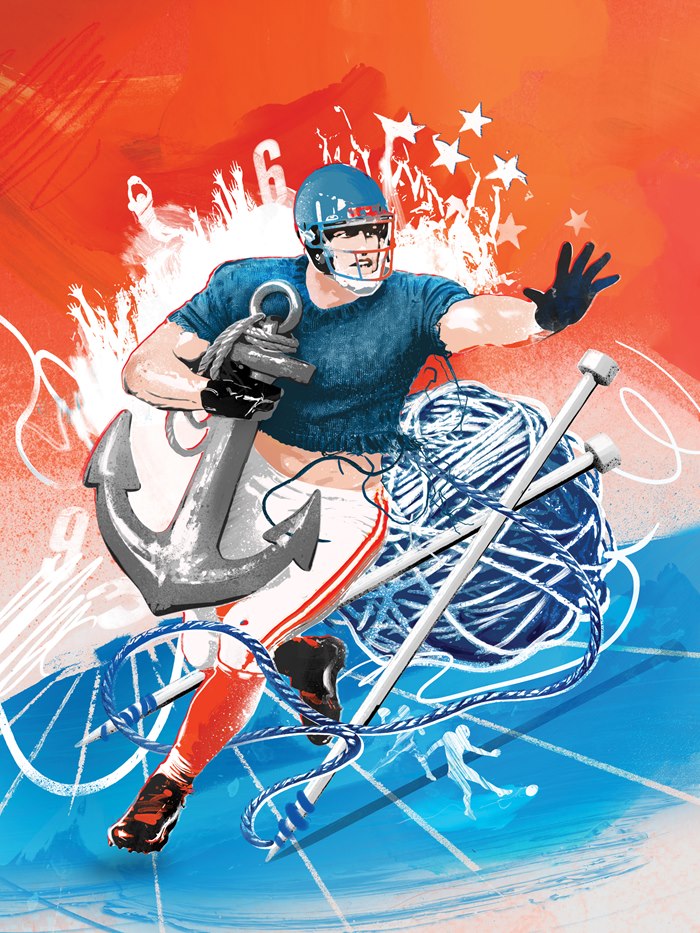
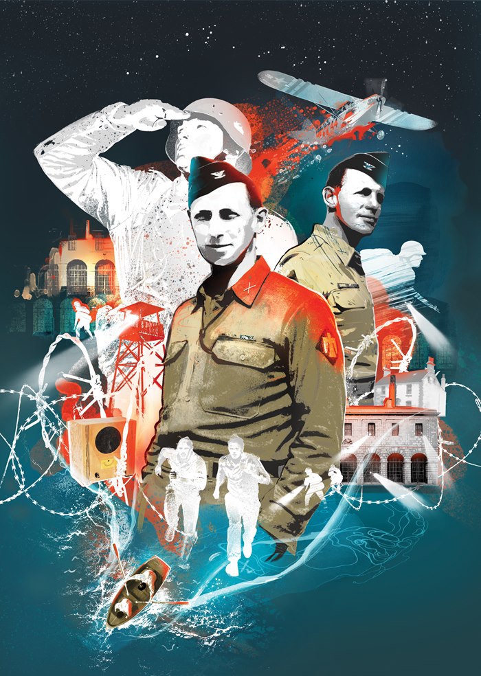
Danny Allison illustrates a stamp series tracing the links between Jersey and the United States.
A presidential visit, an escape during wartime, Jersey cows and even the origins of New Jersey form the basis of a new stamp collection illustrated by Danny for Jersey Stamps, marking the long-standing links between the island and the United States.
Created for the Jersey's International Connections issue, the set explores how people, products and ideas have travelled across the Atlantic, shaping relationships that continue today.
Linking such varied stories was central to the brief. Danny's artwork creates a coherent visual language across the series, bringing together the diverse subjects while allowing each stamp to retain its own identity.
We talk to Helen Brady about landing and executing her first big project in children’s publishing – illustrations for three Pocket Potter books by JK Rowling.
Words by Garrick Webster
In May 2024, Helen Brady was a new illustrator with plenty of potential and a small portfolio demonstrating her skills in character creation, storytelling and an ability to evoke a slightly creepy and mysterious atmosphere. As we write, just over two years have passed and the UK-based illustrator’s name is attached to one of the biggest children’s fantasy franchises the publishing world has ever seen.
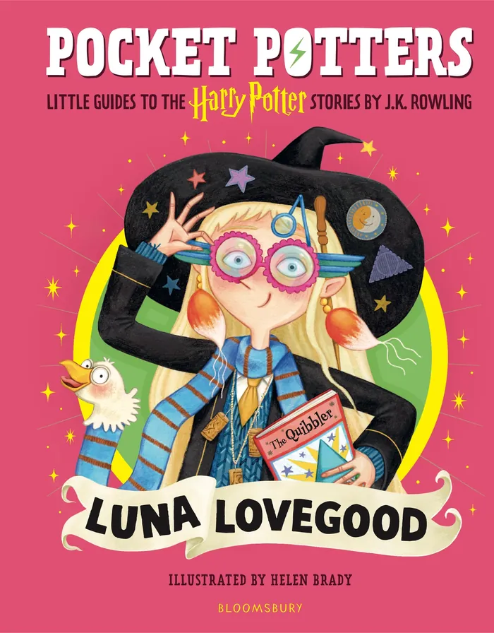
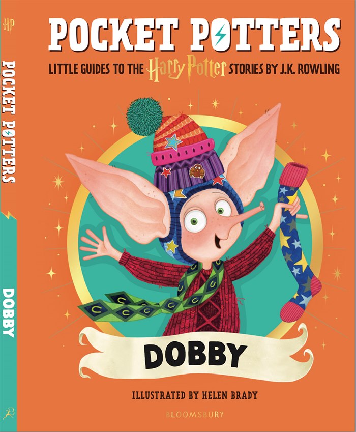
In February 2026, Luna Lovegood from the Pocket Potter Stories by JK Rowling was released full of Helen’s frankly quite magical illustrations. In August 2026, this was followed up with a Pocket Potter tome all about Dobby, one of the Harry Potter universe’s best known, best loved, and most puzzling characters.
It’s a transformation that has seen Helen shift from creating nuanced, sophisticated, almost Rackham-like storybook imagery to work suited more to younger readers – there’s less happening in the shadows, with lots more fully illuminated bright colours. Yet that same quirky charm, personality and hints of mystery remain. It’s all been possible thanks to working with a great client in Bloomsbury Publishing; lots of support from Helen’s agency, IllustrationX; and thanks to her own boundless creativity.
A dream commission
Everything was very secret squirrel in the beginning, as you’d expect. An NDA was signed and a brief came through requesting two character designs – one for Luna and one for Dobby.
“I was absolutely buzzing. They’re characters I absolutely love and relate to in many ways. I knew they were trialling other illustrators, so I was hoping but not expecting to be chosen,” says Helen.
“But I was determined that I would at least produce work that made the team notice me, so I sent them the character designs plus a fair few additional sketches of the characters in different poses and secondary characters that could be included too.”
Soon, Helen had landed the job, joining a line-up of illustrators working across the Pocket Potter series that includes the likes of Olia Muza, Laura Proietti, Natalie Smillie and Paola Escobar. For Luna Lovegood and Dobby, the commission required the creation of the key character posed for the jacket image, plus 13 double-page spread images filled with the main characters, settings, props, details and secondary characters.
“There was quite a quick turnaround so I mainly sketched in pencil and ink and added colour digitally, aiming to retain some of the hand-crafted texture while benefitting from the convenience and speed of colouring digitally on my iPad,” says Helen. “There were also so many tiny details that would have been really difficult doing by hand unless I'd worked on a huge scale, so these were pretty much all done digitally.”
Honing the tone of the imagery
While Helen’s style tends to gravitate towards more muted palettes, shadows and perhaps a slightly creepier outcome, to hit the right tone for a five- to 10-year-old age range, Helen had to use punchier colours. This would also ensure the artwork could sit cohesively with that of the other books in the series.
“I remember sending my first colour rough over and Danielle Webster-Jones, my lovely art director, sent a message back saying something along the lines of, 'This is a lovely, sophisticated palette but could we try brightening x, y and z.’ I think that was her incredibly kind and diplomatic way of telling me it was too dull,” laughs Helen.
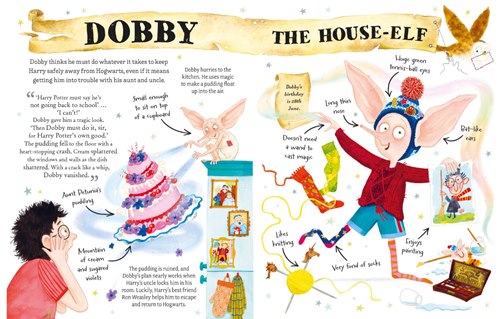
But it wasn’t only Helen’s colour sense that shifted for the series. For example, Dobby himself is a complex, damaged character – some younger children would find him troubling. As might some adults! So, working with the team at Bloomsbury, Helen retained some of his oddness and charm, but took away some of the bandages and wounds.
“I hope I've captured his silly, loveable and tenacious energy still, and I really hope the children it's aimed at will enjoy my portrayal of him and his antics.”
The learning curve is a spiral staircase
While Helen feels she had a great deal of creative freedom, she also took on the brief with a view to learning what it takes to work on such a project from one of the biggest names in publishing. One key challenge turned out to be the spiral staircases that seemed to crop up with regularity – something Helen spent a long time trying to reconcile with her style. But there was also the opportunity to flex her creativity.
“I particularly loved the larger scenes where I could conceal narratives or objects in the background like the Hogwarts Kitchen scene in the Dobby book,” adds Helen.
In the Luna Lovegood book, there is a scene about the magical creatures Luna believes in, and it was suggested that these images were presented as Luna’s drawings. That begged the question: should Luna’s style differ from Helen’s? Along with the team at Bloomsbury, Helen pondered what Luna’s creative voice might be.
“We discussed what we were into as teenagers and I said I was in my Egon Schiele and Modigliani era at that point, so we landed on something along those lines with Luna's painting having elongated faces and eyes,” she says. “We also decided to ditch some of the picture frames and add fun tape and pins and Luna's signature to her paintings to add to the DIY-feel.”
From a spread that made her feel nervous, Helen worked with the team to create something inspired and original.
“It’s pretty much a dream come true!” says Helen. “To work on a book based on Harry Potter, which meant so much to me personally growing up, to illustrate characters I already absolutely loved and then to have the opportunity to work with the loveliest, most talented team who have just been brilliant work with – I’m not sure how I'm going to top it, really. I'm going to have to write and illustrate a bestseller now, there is no other option at this point!”
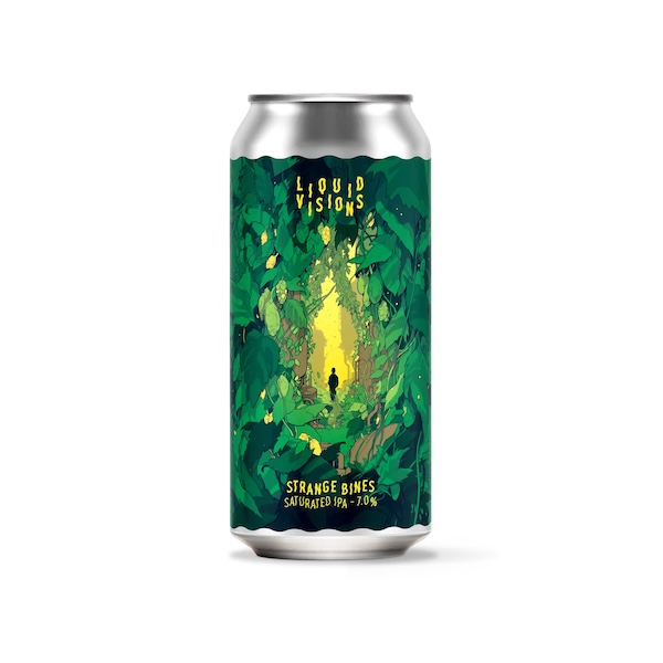
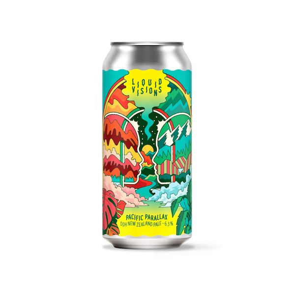
Jordi, Andy and Simon created imagery for BrewDog’s Krush Test Dummy, Pacific Parallax and Strange Bines beers respectively. These beers are in BrewDog’s Liquid Visions range. BrewDog has a long history of utilising leading-edge illustration on its packaging and, since the brand’s takeover by Tilray Brands, it has been continuing the tradition.
Film director, and artist - represented by Artist Partners - produced a stunning image for a project for Kalshi.
Martyn said it was a great pleasure and very rewarding to be able to create this digital image for the 250th Anniversary of the founding of the United States with the Declaration of Independence.
Kalshi commissioned 17 original works, celebrating defining moments in American history : :https://kalshi.com/america250. The project was handled by the excellent Liz Laine Reps, Inc a new boutique animation agency es muy good.Martyn was briefed to depict the 1980 Winter Olympics “Miracle on Ice” which is is one of the greatest upsets in sporting history where a team of young American college players took on the professional, seemingly invincible soviet Union Team. Composing and painting the image Martyn went for a strong dynamic “lines of action” , to capture the intensity of the game.
These artworks are used on digital pavements, on social media and digital billboards.
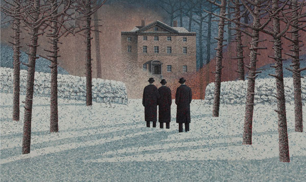
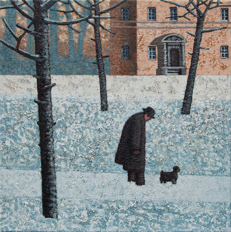
Mark Edwards has been represented by Artist Partners as an illustrator for many years - from his successful career in illustration he then developed his own personal work and paintings and has become a sought after name and fine artist. Mark is known for his remarkable paintings entitled: The White Wood, depicting a very unique story in each painting.
Mark’s solo exhibition and new work will be shown at the Catto Gallery In London NW3 from the 1st October - 19th October
All of Mark’s previous exhibitions have sold out - for more of Mark’s previous illustration and paintings please go to our website :
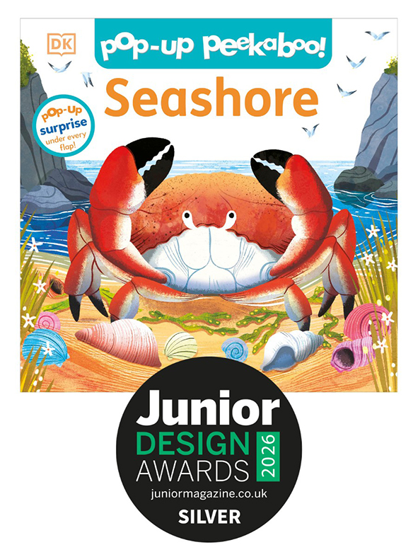
We are so chuffed for our Amy Grimes, who has won joint Silver in the Best Baby Book 0-2 category for ‘Pop Up Peekaboo! Seashore’ for DK books, in The Junior Design Awards 2026.
“Little ones will love lifting the big flaps to discover five delightful surprises, from a scuttling crab, and playful seal pup, to an octopus hiding in a rockpool”
“The bright, high contrast illustrations really bring the seashore to life, helping young children connect the world on the page with the world around them” Bonita Turner, editor of Junior