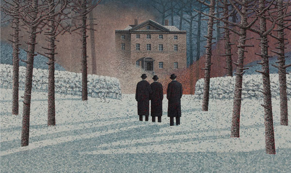
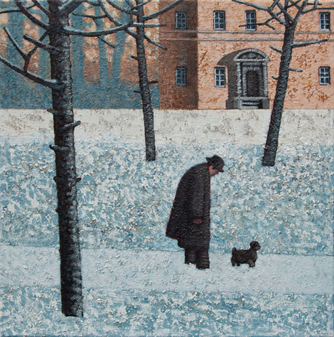
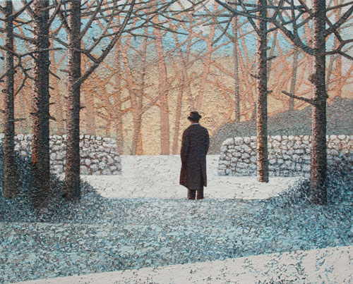
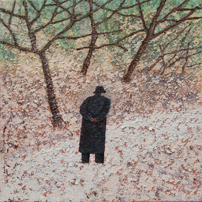
Mark Edwards has been represented by Artist Partners as an illustrator for many years - from his successful career in illustration he then developed his own personal work and paintings and has become a sought after name and fine artist. Mark is known for his remarkable paintings entitled: The White Wood, depicting a very unique story in each painting.
Mark’s solo exhibition and new work will be shown at the Catto Gallery In London NW3 from the 1st October - 19th October
All of Mark’s previous exhibitions have sold out - for more of Mark’s previous illustration and paintings please go to our website :
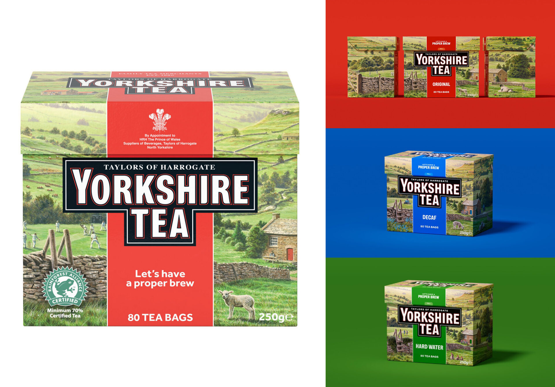
British nature and wildlife illustrator Andrew Hutchinson gives the Yorkshire Tea packaging a refresh.
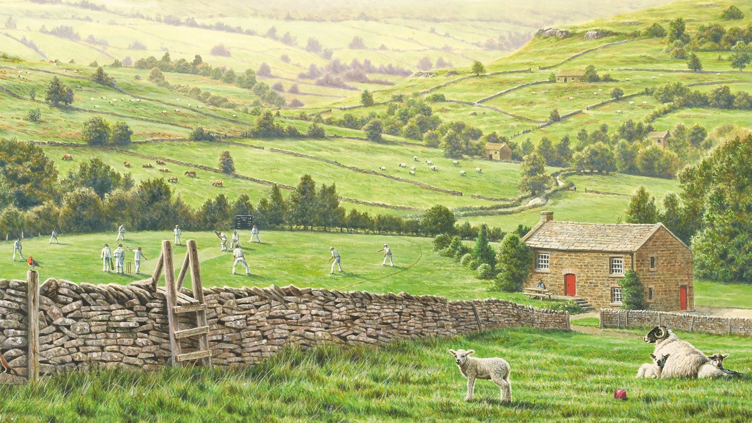
Back in 2011, Andrew Hutchinson painted an idyllic rural Yorkshire scene which has adorned the Yorkshire Tea box ever since. With a refresh of the brand taking place across 2025 and 2026, branding agency Turner Duckworth commissioned Andrew to refine the popular image by adding and altering some of its elements to fine tune the packaging for two product variants. We asked Andrew about the variety of tiny paintings he created for the refresh and the creative decisions made along the way.
How did this project come about?
I produced the existing Yorkshire Tea box illustration back in 2011 when the company decided they wanted to redesign their box without losing the very strong overall Yorkshire Tea look. Turner Duckworth approached me via my agency, IllustrationX, in 2024 regarding the refresh.
What was the brief?
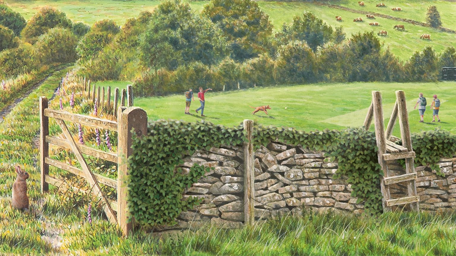
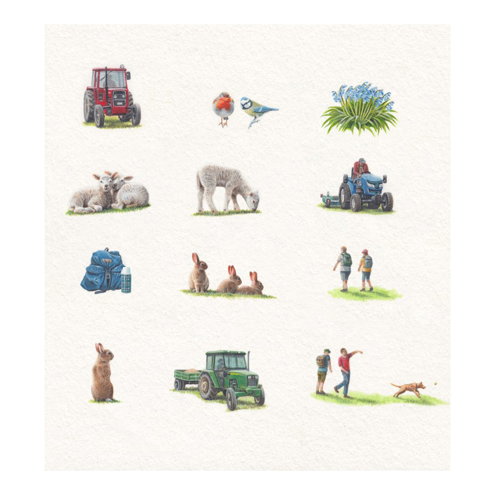
The brief for this job was to refresh the existing design without spoiling an already popular image. Because of this, any alterations had to be made very subtly. The idea was to give each of the variations of Yorkshire Tea – Decaf, Hard Water and the Original – its own unique identity. A selection of small additions, themed around the branding colour of each tea variation – red for Original, blue for Decaf and green for Hard Water – would be painted, which could be sensitively inserted into the design. For Decaf, blue bells, a blue rucksack and flask and a blue tit were chosen; for the Hard Water, green ivy and a green tractor tie in with the colour theme. Variations were made in the foreground of each box by replacing the lamb with a different one on the Decaf and with rabbits for the Hard Water. Only a couple of tiny alterations were made to the Original box – a cricket ball and a robin. Customers do study these images very closely and I think part of the idea was to give them some new elements to look for.
What was it like to receive this brief?
I was very proud to be asked to work on this design again. Working with Yorkshire Tea has certainly been a career highlight.
What media and tools did you use?
I only use a brush and paint – no computers! The paints I use are acrylic and I paint on a hot press watercolour board. Once completed, my wife Louise scanned the artwork and sent it directly to the designers as digital files.
How was the content of the images decided upon?
The landscape of the box has remained the same as the original and was based on a variety of areas of Yorkshire selected to create a single non-specific Yorkshire landscape. For this job, the designers gave a very clear brief of the alterations they wanted to make and had a list of suggested elements to incorporate but were equally open to any suggestions or comments that I had, particularly about the wildlife elements. One of the elements they were particularly keen to incorporate was a tractor in each image, reflecting the relevant brand colour. Another aspect that the designers were keen to change was the cricket pitch. So, while the original box has a village cricket match in progress, the Hard Water design has dog walkers and hikers crossing the pitch and on the Decaf box there is a tractor mower doing some pitch maintenance.
The tone is relaxing, like having a cup of tea. How did you conjure this feeling?
The lighting and colour had to remain consistent from the original box and across the three designs, so any additions obviously had to tie in with this. I hope the warmth of the colours and intimacy of the design creates this comfortable feel.
Tell us about the little stoat?
The stoat was not particular to these designs but has appeared on all my Yorkshire Tea boxes – my signature if you like. I always try to include some animals in the artwork and stoats love dry-stone walls. It was a bit of a last-minute addition on the original design and could have been painted out but, as it was, the designers loved it and it stayed. All the artwork I produced for the additions was done on white for the designers to incorporate into the images digitally.
What were the main challenges?
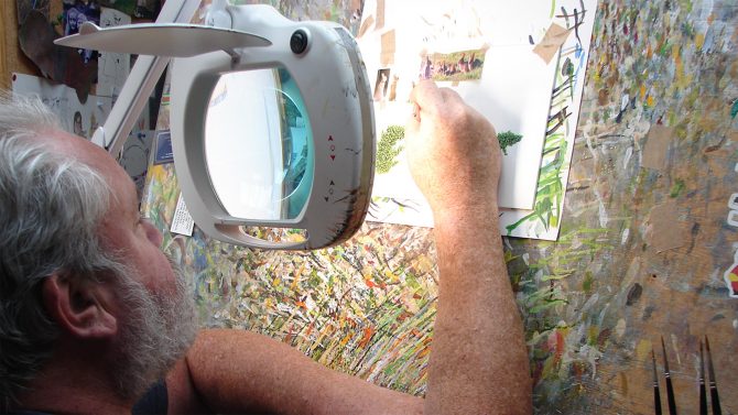
All the additions made to the box, for consistency, had to be painted at the same size as the original artwork; one quarter up. This meant that some of the elements were tiny with the tractors being no bigger than my thumbnail. And, although I am a miniature painter, something like an ivy leaf, a bluebell and even some of the figures were so small I could not have done them without using a large magnifying lens.
What were your favourite elements to paint?
I particularly enjoyed working on the ivy that drapes over the wall of the Hard Water box and was particularly pleased that it sat so well in the picture.
What was the collaborative process like?
All the designers I have worked with over the years on Yorkshire projects have been a pleasure to work with; supportive and open-minded. And once the roughs had been approved were always great at leaving me just to get on with my painting.
And do you enjoy a cuppa while working?
Of course, I drink Yorkshire Tea and always have a brew when I am working. Tea-time usually starts at 10:30 when everything stops for Ken Bruce’s Popmaster quiz.
What’s your verdict on the outcome?
I was delighted with this job and it’s always a special thrill when you see your artwork on the supermarket shelves.
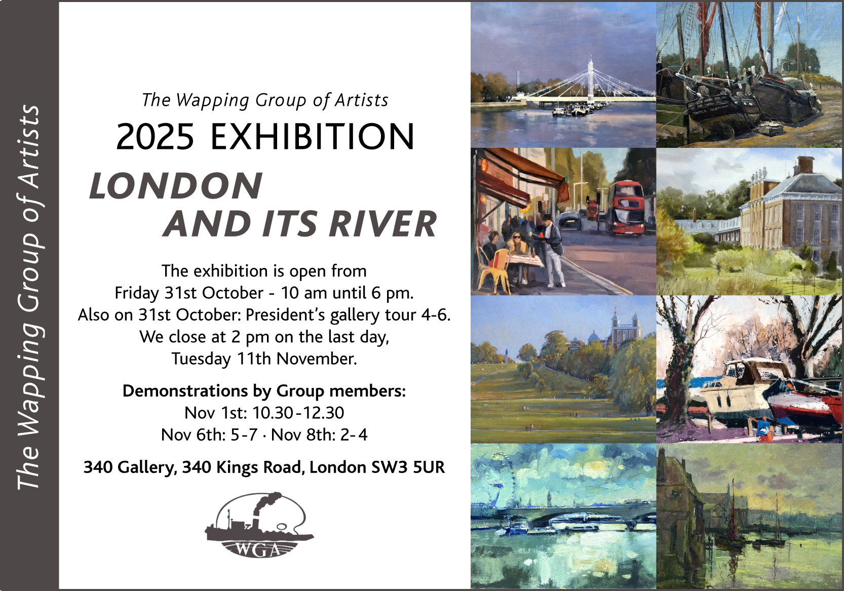
Geoff Hunt is one of the Artist Partners long standing artists and one of the leading artists of his generation and respected worldwide as a RSMA artist, and who will be showing more of his stunning artwork at the Wapping Group of Artist’s annual exhibition.
Geoff Hunt who is one of the worlds finest painters of 18th and 19th century ships, and also world famous for producing the amazing artworks for the Patrick O’Brian Books specifically for the series Aubrey Maturin Novels -
Focusing on another local artist, Artist Partners have also enlisted - the brilliantly talented Lisa McGuinness.
We think her lovely realistic paintings of real characters, are just perfect for the YA marketplace -
Lisa has spent most of her career as a designer working in fashion and shoe design, taking her all over the world.
Her beautiful work is expressive and stylish - her love of commercial fashion means she’s able to use her art translating it into magazine covers, advertising and branding.
Beautiful paintings by Gary Blythe represented by Artist Partners have been posted on our social networking channels over the lockdown this particular painting is titled: Job Application … it is a work in progress, acrylic on board.
For more of Gary’s masterful paintings and drawings, please check out the website :
Martyn Pick is a British Director and Animator - he is recognised for his distinctive fusion of live action and animation, and his fluid painterly style of his film making, and so he was the ideal choice to commission him on these digital paintings for Hellfire a TV series being developed at the moment by Andrew Blackall and Paolo Russo.


 British nature and wildlife illustrator Andrew Hutchinson gives the Yorkshire Tea packaging a refresh.