The SAA are very pleased to be supporting the World Illustration Awards by sponsoring The SAA Agents Award for New Talent.

Introducing: Allie Runnion

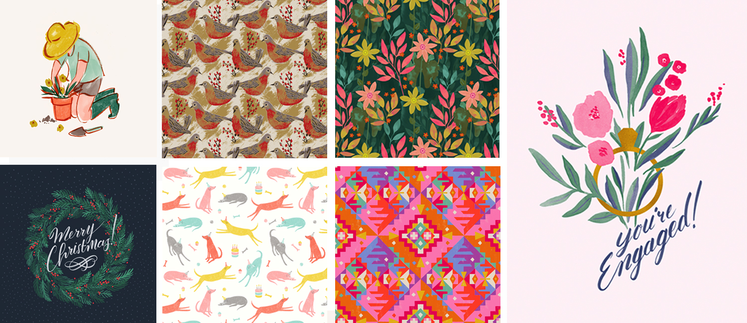
Inspired by vintage illustration, and with a degree in Illustration and English from the highly-esteemed Rhode Island School of Design, Allie Runnion’s bright, bold designs and strong sense of colour and texture lend her work an immediate appeal, combining the warmth of a subtle nostalgia with an undeniably trend-savvy energy.

Allie dropped into our New York office earlier in the summer, and chatted with agent Hannah Curtis (in the States for a raft of industry trade shows and client meetings) about her creative motivations and ambitions.


Where do you find inspiration for your work?

I find a lot of inspiration in old things, especially mid-century illustration and design. I’ve always been a collector and love to shop in antique and thrift stores. I curate an instagram account, @vintageillustrated, where I scan and post images that I find as inspiration for both myself and other artists. I also live in the beautiful state of Maine and find so much inspiration in the natural beauty around me.

What are some of your favorite things to illustrate?

Patterns! Florals are probably my favourite. I love flipping through old field guides and gardening books as reference, and discovering new flowers and plants to draw in my backyard. I also enjoy draw animals and am working on incorporating more figures into my work.

Left to right: Allie shares a glimpse inside her tranquil design studio; leafing through vintage books and guides on botanical subjects, ink pen in hand
As a designer and illustrator specialising in surface pattern design, Allie has a fantastic array of repeat designs in her portfolio, but also creates beautifully observed, sensitively rendered standalone artworks with a spare use of line and distinctively nuanced palette.

Has your style developed at all since you began illustrating?

Yes! As an Illustration major at RISD, I struggled to find my style, bouncing between graphic work and more painterly styles. After graduating, I began my career as a graphic designer and narrowed in on more graphic work. As I have returned to doing more illustration work in the last few years, I now feel much more at home with my style. I love merging traditional drawing and painting with digital techniques that I have learned through years of experience in graphic design.

Allie's portfolio also includes examples of her hand-rendered typography and figurative work - a truly versatile artist!

Do you have a dream project you’d like to work on?

I’d love to work on a bedding or home collection, or do packaging work for a fun brand!


To view Allie’s entire portfolio, click here. You can also enquire with her agent, Hannah Curtis, about licensing specific pieces or to discuss commissioning bespoke artwork.

Behind the Book: Monty & Sylvester by Carly Gledhill


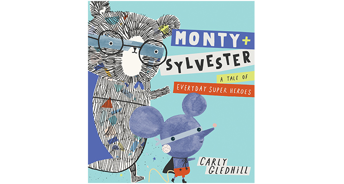
Carly Gledhill’s artwork style is immediately recognisable for her quirky characters and playful layouts, full of humour and heart. This spring her debut author-illustrated picture book ‘Monty & Sylvester A Tale of Everyday Super Heroes’ published with Orchard Books.

We spoke to Carly on creating her first picture book, and delve deeper into what inspired this imaginative, witty tale, and the loveable duo behind the story, best friends — and unlikely heroes — Monty and Sylvester.

(more…)

Artist Profile: Karl James Mountford

Karl James Mountford is one of Bright’s most successful and instantly recognisable artists. His distinctive visual language channels a retro aesthetic that, while acknowledging the legacy of some of the true greats of the illustrative and animation ‘canon’, is never cosily nostalgic, and which makes striking use of an often limited palette and wonderfully textural, hand-rendered effects - all delivered with an undercurrent of the ever-so-slighly-unnerving…

Specialising in cover and editorial illustration, recent commissions have included some fantastical book cover design briefs such as The Uncommoners by Jennifer Bell (Jan 2017, Penguin Random House) and The Peculiars by Kieran Larwood (Jan 2018, Chicken House), but Karl is also a keen believer in the importance of pursuing self-directed projects with a ‘just for the hell of it’ flourish guaranteed to keep the imagination limber and creative fires stoked. A voracious reader of fiction, he also has a keen interest in all manner of creative arts - particularly traditional, ‘hands-on’ techniques such as printmaking - while an abiding affection for the cult shows of his childhood, and the iconic artists and creatives whom exerted such an influence on their aesthetic, clearly informs his own artistry.

Karl James Mountford chats about his inspiration, working method, and creative aspirations:


Can you tell us a little about your artistic background and training?

I’ve been drawing from the get-go, but began to really focus on it all when I started art college. I was on this amazing art course that did everything from photography and ceramics to graphic design and painting. It was such a well-rounded course, but illustration was the aspect I enjoyed most, and my final project was re-designing book covers.

Self-directed book cover artwork: top line, left to right: The Great Adventures of Sherlock Holmes by Arthur Conan Doyle, Coraline by Neil Gaiman, Werewolf of Paris by Guy Endore; bottom line, left to right: Smoke and Mirrors, Kristin Halbrook, The Iron Man, by Ted Hughes, Wuthering Heights, by Emily Brontë.

I then went to a real gem of a university, Swansea Met (now Swansea College of Art) to study Illustration and screen-printing. The course explored everything about illustration - not just picture books - and we had life drawing every week, which I think was so helpful for heading into the art profession. I proper loved the place and the people there so much: I stayed on to do my Masters degree in Visual Communication while becoming an Artist in Residence for the Illustration Department.

Your portfolio includes an impressive array of work, referencing popular culture, e.g. tributes to the Stranger Things Netflix phenomenon, Lemony Snicket’s A Series of Unfortunate Events and those knitting superheroes, as well as your own unique take on classics, such as Peter Pan, that we’d pretty well all recognise. How much would you say ‘story’ and nostalgia are important motivators or influences in your work? And do you think you are drawn to any one genre in particular?

Story and nostalgia are massive motivators for me. All the book covers I’ve mocked up for my portfolio are ones I’ve enjoyed reading growing up, and there is something really special about creating a book cover that houses a story you love. It’s the same for paid work: when I get a brief, I (almost) always read the manuscript (although sometimes I will have to skim-read) because it’s the best tool. If you know the ingredients, you can make a cake - it’s a bad analogy, but knowing the story means you can find the tone of it and hopefully make a great book cover/art…or even cake. That said, there’ve been one or two occasions that I haven’t read the manuscript in full and it shows in the final work. Maybe not to everyone, but to me it does.

Karl’s homage to Stranger Things (Netflix series, 2016), and his tribute cover artwork for A Series of Unfortunate Events (now also a popular Netflix series created from books by author, Lemony Snicket, Feb 2017).

Pop culture is the best, too: people love to see something they enjoy or have a personal connection to recreated through an artist’s impression or homage. EVERY illustrator draws what they love at some point: whether it’s TV or film characters, animals, food - whatever it is, it’s always a good place to start. Drawing things you are interested in spurs you on to try your best. I do lean towards stories that are darker…Maybe ‘darker’ isn’t the right word. Perhaps ‘truer’? Maybe not that word either…but a story that doesn’t try and ‘hold my hand’ too much has far more appeal for me.

Superheroes reimagined as avid needle-workers, left to right Superwoman (DC Comics), The Mighty Thor (Marvel) and Captain America (Marvel).

The picture books and stories I remember from being a kid weren’t the ones with comfy tales and endings, it was the ones where I put myself in the characters’ shoes, and had to think about myself in that situation. Like Maurice Sendak’s Where the Wild Things are and David McKee’s Not now Bernard…which is terrifying, and it wasn’t really because of the monster; it was that worry that my parents would ignore me and I’d end up being eaten by a monster down the end of the garden. But when you’re five…I just thought it was the monster that gave me wiggins, when really it was the parents’ neglect.

In an interview for Waterstones about A Place Called Perfect for which you were shortlisted for the Waterstones Children’s Book Award 2018 Younger Fiction category (congratulations!), you mention having been drawn to the project because that writing had a slightly darker tone. Much of your illustration (I hope it’s fair to say) does have a wonderfully quirky, slightly unsettling quality to it – which, of course, is part of its distinctive appeal – but how differently do you think you might approach the artwork to a story with a less threatening undertone?

Completely fair to say. I might contradict myself a bit here…I think two or three years ago I would lend myself to whatever the client wanted, I was just so grateful that I was getting any work at all, and after two years of solo freelancing (without an agent) I was desperate to turn something I love doing into a job. But you are asking me today and I think, now, I’d have to read it [the work] before I said yes, OR at the very least get a synopsis and flavour for what the client wants. I’m at this weird point in my career where I’m not just saying yes to everything, because as much as being able to pay your rent is great, it’s like winning the lottery when you’re hired for a project/story that interests you and that you can really get behind. You can really invest yourself - and that surely means you’ll make better work.

Are there other sources of inspiration you draw upon on a regular basis? Are there any artists - of any discipline - whose work you find particularly inspiring?

Oh, for sure. Alice and Martin Provensen are probably some of biggest influences - their use of shape and colour! Disney’s Mary Blair too, and Shaun Tan, who I think is the best storyteller this world has. Film-makers Spike Jonze and Wes Anderson, too - again great visual storytellers! I have a stack of old books - you know, the sort of old books that are over-decorated but with few colours and those geometric-patterned borders. Books used to have a real class about them, back in the day. I love the old Penguin books from the 50’s and 60’s, too. Also, ANY screen-printers, past or present - there is a magic with screen-printing that is different to painting or ‘colouring-in’ on Photoshop. It’s sort of flawed and random, but kind of perfect too?! Tom Frost is one of those screen-printing artists whom I admire a lot. And when I say ‘admire’, what I mean is, if I could trade skills, it would be with him.

Clockwise from top left: The Animal Fair cover art - Alice & Martin Provensen; concept art from Cinderella - Mary Blair; interior illustration from The Arrival - Shaun Tan; A Book of English Clocks and British Reptiles and Amphibia - Penguin books: artist unknown; limited edition screen print - Tom Frost.

I think anyone or thing that reminds me of something older [artisanal, hand-crafted], sparks my interest. I’m not knocking digital art - I use it every day, and it’s a god-send for speeding the process up (and the possibilities are endless!) - I’m just fond of getting my hands dirty when making work.

Could you give us a bit of an insight into your process when you embark on a new project? Where do you start, and what stages would you typically follow to arrive at the final artwork?

I usually start reading the manuscript and making notes, then I read over the brief. Usually a publishing house has an idea of what they want me to do ‘looks wise’ with the book, but I always make a few alternative rough ideas for a cover, just so we’ve explored all the possibilities. Also it’s nice not to just go with the trends on the bookshelf but instead try make something that’s a bit different and tailored to the story inside. Once we’ve settled on a design, I do colour tests - again just to make sure we haven’t missed a trick. It’s a lot of ‘back and forth-ing’ but I really enjoy the development of book covers and artwork.

Do you ever suffer from a bit of an artistic ‘block’ and, if so, do you have any methods you’d be prepared to share for overcoming those times and rediscovering your creative mojo?

Oh, for sure. A lot of the time artist block for me is from burning out. I’ve found the best thing I can do is just go with it. Having an illustration break is just as important as working round the clock. I make a lot of lists too; nothing fancy, but just lists of personal work I want to explore - topics on mental health to food packaging - so when free time comes about I can ponder on those and try and make something. The lists help when I’m at a loose end, art wise. It gives me a starting point.

Do you ever have time, as an illustrator, when you are not being creative – and, if so, how do you like to fill it (aside from sleeping…!)?

It feels like an all-around-the-clock sort of thing. It’s not like a normal job: there is no 9-5 cut-off point. Even when you’re out and away from the desk, you’re always thinking ‘oh that would be a cool building to draw’ or ‘this might be useful for a story idea’. BUT, that being said, I like to see my mates and be around my favourite folks - and be outside, of course, walking the dog down the beach. And I love a bit of D.I.Y too - especially wood-work, fixin’ up stuff.

What has been your favourite project to date?

Favourite…I like most of them, and they are all special for some reason or another. BUT Kieran Larwood’s The Peculiars I’m a bit proud of. It was a re-brand job, but the folks over at Chicken House gave me a ton of freedom and trust to just make a decent book cover. It wasn’t over stressed about, and it was just a seamless project.

And finally…which book/film/Netflix series would you most like to create cover artwork for?

Philip Pullman’s His Dark Materials - 100%. But I’ve got a list. I would love to illustrate some more classic novels too, and maybe do the artwork for some big festival – I reckon that would be amazing to be a part of.

Check out Karl James Mountford’s full portfolio here, or contact Bright Illustration’s Fiona Kenny for further information and to discuss commissioning.

Introducing Bryony Clarkson

Bryony Clarkson is one of Bright’s newest talents. Having graduated from Loughborough College of Art with an emphasis in textiles before studying for an MA at the Royal College of Art in London, she has now switched her focus from fabrics to work with a mixture of cut paper collage and digital techniques.

Her signature style features rich textures, palettes that pop and quirky animals with lots of personality. But how does she achieve such gorgeous finished pieces?

We chatted with Bryony about her process and inspirations, as well as some of her biggest artistic achievemnets. Read on to learn just how she weaves magic with her art and to get a glimpse of her dreamy studio.


How do you feel your experience as an embroidery designer has impacted the way you work and create now for your art licensing clients?

I work in exactly the same way with paper, as I used to with fabric. My embroidery designs often involved small pieces of fabric, appliquéd onto a base fabric to create the image. Then the stitches made ‘drawn’ lines, for detail. I’ve simply swapped fabric and thread for paper and pencils! The thought process is no different at all.

I also studied colour a great deal as part of my textile design training, which is now a natural art of my thinking. I have favourite ‘go-to’ colour schemes that I rely on all the time, as well as loving to play with new combinations and looking at colour trends.

What do you find to be your biggest sources of everyday inspiration?

Definitely my children. We chat about ideas for fun things to draw, that would appeal to them, all the time. They are my best inspiration and harshest critics! I also love to see the uninhibited way that they draw, which inspires me to try and have a spontaneous feel in my own work.

What has been your favorite project to date and what made it so special?

I adore drawing animals, and some of my favourite pieces of all time are my series of circus images, which I worked on, on and off, for quite a long while. I really enjoy trying to build expressions and character into the pieces, which I hope makes children really relate to them. When I have got a character just right, it almost feels as if I know them. I definitely feel like that about my Juggler, Ringmaster and their animal friends.


TAKE A PEEK BEHIND THE MAGIC CURTAIN

Bryony shares a view of her workspace

An art supply lover's dream!


To view Bryony Clarkson’s entire portfolio, click here. You can also inquire with her agent, Hannah Curtis, about licensing specific pieces.

Laura Hughes wins Oscar’s Book Prize 2018

Laura Hughes wins the highly esteemed children’s book award with author John Dougherty for their laugh-out-loud picture book ‘There’s A Pig Up My Nose!’.

We are delighted and immensely proud that Bright artist Laura Hughes has won the Oscar’s Book Prize 2018 alongside author John Dougherty with their original and witty picture book ‘There’s A Pig Up My Nose!’, published by Egmont.

John’s loveable tale of a little girl, Natalie, and a nose-dwelling pig, Ernest, is full of hilarity and surprise, beautifully married with Laura’s playful artwork. It’s a joy to read as you follow Natalie’s increasingly absurd attempts to get a pig out of her nose — even hanging upside down whilst being walloped with a blow-up rhino doesn’t seem to do the trick. It’s silly, utterly heart-warming, and with plenty of laughs — and OINKS — along the way.


The Oscar’s Book Prize is an annual award celebrating the best books for under-fives from the year. Previous winners have included Bright artist Benji Davies who won in 2014 with ‘The Storm Whale’. You can read more on the award here.

HRH Princess Eugenie awarded the Oscar’s Book Prize at St James’s Palace on Monday 14th May. From left to right: Vicki Willden-Lebrecht (MD, The Bright Agency), author John Dougherty, artist Laura Hughes, Emma Dods (Senior Commissioning Editor, Egmont), Laura Hughes, Rebecca Essilifie (Art Director, Egmont).


Laura Hughes:

“I am absolutely honoured that ‘Theres’ a Pig Up My Nose’ has won the Oscar’s Book Prize! The award was set up in memory of 3-year -old Oscar Ashton who died of an undetected heart condition, and as well as being a wonderful and touching way to pay tribute to a young reader, the prize also aims to highlight the importance of reading together with young children. Low literacy levels among children starting school is an increasing problem, and the organisers of the award are doing great work in bringing awareness to this issue. It’s a privilege to have been involved in this very special award.

“The first time I read John’s story I absolutely loved it and knew right away that I had to illustrate it! ‘There’s a Pig Up My Nose’ is a warm and quirky tale about a girl who gets a pig stuck up her nose, so I knew that I had to keep the illustrations bright and light-hearted. I used a slightly different process in creating the artwork than I usually do, with some parts coloured directly from my roughs (something I generally avoid) to keep the illustrations loose and energetic.

“For the characters in the book I took inspiration from the diversity of the people I see every day in London, so for example, the doctor is based very loosely on one of my own GP’s. I live in Walthamstow and will often sit and draw in local cafés. I think it’s really important to get out of the studio and draw from life whenever possible to keep your work fresh and relevant.”

You can also watch Laura’s interview with the Evening Standard here.


“I am absolutely thrilled that Laura has won the Oscar’s Book Prize and it’s wonderful to see her grow from Kingston University graduate and Bright intern to an award-winning illustrator. Laura brings such exuberance and flair to her artwork — she is a true talent and I’m so proud of all that she has achieved.” Vicki Willden-Lebrecht

Laura Hughes’ past titles include ‘The Birthday Invitation’ (Bloomsbury Children’s Books), ‘The Chocolate Monster’ (Faber & Faber), and ‘We’re Going on an Egg Hunt’ (Bloomsbury Children’s Books). Her next picture book, ‘Quick, Barney, RUN!’ (Faber & Faber) is publishing this summer on the 5th July. You can see more of Laura’s artwork here.

The SAA Associate Prize for New Talent in Illustration at New Designers 2018, Part 2 July 4 – 7

The Society of Artists Agents (SAA) is delighted to be working in partnership with New Designers 2018.

(more…)

Making Waves with Chloe Daykin’s Fish Boy, and Richard Jones

Cover art for Fish Boy, by Richard Jones

If you scan through the reviews of Fish Boy, you will see, over and over, these words: “reminds me of David Almond — think Skellig”

And that is more than enough for me. It also came as no surprise that it was nominated for a Carnegie Medal*

Not only is this debut novel by Chloe Daykin akin to the style of David Almond — a great and true compliment there from reviewers and critics — but the artwork, by Richard Jones is equal in both atmosphere and feel.

RJ:  “. . . it was clear I hadn’t quite lost my love of the fine arts and after I graduated I somehow, and to the complete surprise of anyone who knew me, found myself staying on and reading for a PhD. My subject was the application of the fine arts in illustration and it took me four years to finish. It was a great experience and I learned an awful lot, however, my mum is the only person who calls me Dr now and I don’t use it on my passport just in case I’m asked to deliver a baby or perform an emergency tracheostomy on a plane.”
— From A Journey into Picture Books: The Art of Richard Jones (continue reading here)

Interior artwork for Fish Boy, by Chloe Daykin, published by Faber and Faber


For me, personally, the cover of a book is just as important as it’s contents. Yes — I must admit I do judge a book by it’s cover, and there are some covers that really stand the test of time. In fact the cover work is the very thing that can make an author stand out on the book shelf — and if author and illustrator stick together, both can become recognisable together. Take Roald Dahl and Quentin Blake for example, or C.S Lewis and Pauline Baynes. Although Quentin Blake has books of his own, (and Roald Dahl has worked with other illustrators) we will always recognise the books of Roald Dahl, for example, by the cover illustrations of Quentin Blake. There’s certainly something to be said for continuity in design.

Richard’s most recent picture book collaboration with author Jim Helmore is testament to a great union of words and pictures. The Snow Lion, published by Simon and Schuster in September 2017 has been translated into 14 different languages.

Richard has also illustrated picture books with author Libby Walden, and conservationist, Martin Jenkins who has written an educational series with Walker Books on animals at risk.
Winter Dance, with Marion Dane Bauer — originally a US title with Houghton Mifflin Harcourt, has been coeditioned and translated into four different languages since being published in December 2017.

So what next for Richard? Well he’s one to watch, we can be sure of that. He is an absolute pleasure to work with, and his style has that sense of something we are going to see on bookshelves for a very long time. LM


You can follow Richard on Twitter and Instagram


If you’d like to work with Richard, you can get in touch via his agent, Arabella Stein here.

*The Carnegie Medal is awarded annually to the writer of an outstanding book written in English for children and young people. It was established by in 1936, in memory of the great Scottish-born philanthropist, Andrew Carnegie (1835-1919). Previous winners include Arthur Ransome, C.S. Lewis, Margaret Mahy, Terry Pratchett, Philip Pullman and Patrick Ness.


Let Them Eat Cake! Book Launch Fun with Sue Hendra and Paul Linnet

CAKE by Sue Hendra and Paul Linnet was officially launched yesterday evening at Waterstones in Piccadilly, hosted by our friends at Macmillan Children’s Books.


If you haven’t yet bought a copy of Cake, you MUST! No matter your age, it will make you laugh out LOUD. It’s the perfect example of Sue and Paul doing what they do best.
Here’s our round-up of the evening in pictures.

Life imitating art: An incredible replica of Cake, made out of . . . cake.

And the proof is in the eating — oh poor Cake! This is true #kidlithorror  . . .

Speeches made by Sue and Paul, who spoke about the importance of literacy and storytelling for children, Associate Publisher at Macmillan Children’s Books, Penny Morris, and Agent, Arabella Stein.

Sue Hendra, Bright MD and Founder Vicki Willden-Lebrecht, Paul Linnet and Wanda.

Book signings and party bags, beautifully made by the team from Macmillan.


You can follow Sue and Paul on Twitter

If you’d like to work with Sue and Paul, you can get in touch via their agent, Arabella Stein here.

April 2024
M T W T F S S
1234567
891011121314
15161718192021
22232425262728
2930  

Join the Society of Artist’s agents

but before you do, please read our criteria for joining here