Svetlana Molodchenko crafts a spring-to-summer visual narrative across cover and edges for FairyLoot.
Svetlana was commissioned by FairyLoot to produce a dust jacket and digital edge illustrations for The Swan’s Daughter, bringing a sense of quiet enchantment to the exclusive edition.
Her approach centres on the fragile shift from spring to summer, where soft florals and light-drenched tones echo the novel’s themes of power, survival, and love. Subtle references to the text are woven throughout, giving the artwork a layered, almost heirloom quality.
Extending the imagery across the book’s edges, Svetlana turns the object itself into a continuous scene, inviting the reader to step into a suspended fairytale moment.
How Andrew Hutchinson refreshed the Yorkshire Tea box art – the proper way
With its brand refresh by Turner Duckworth, Yorkshire Tea wanted to fine tune its packaging illustration and colour code it across the product range. Nature illustrator Andrew Hutchinson was the ideal artist for the job.
Words by Garrick Webster
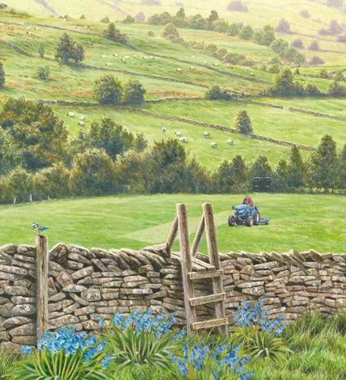
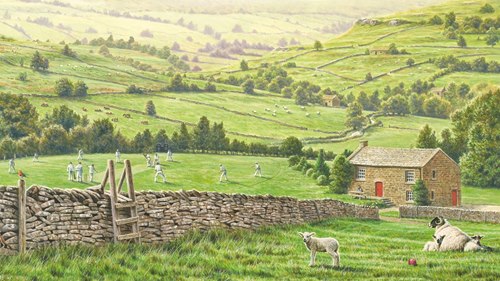
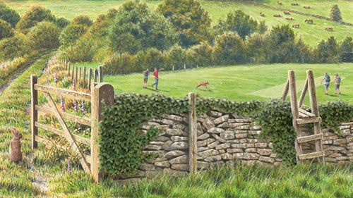
Yorkshire Tea is a brand that stands out in the market for its quality, and for its packaging. Whereas other options often come in flat coloured boxes – red, or gold, for instance – the Yorkshire Tea box is a work of art – literally. You can put the kettle on and pore over a finely painted scene in the Dales, with details as subtle as the spots of lichen on the dry-stone wall.
This beautiful imagery was painted by the leading British wildlife illustrator Andrew Hutchinson back in 2011. With its tag line ‘Let’s have a proper brew’, Yorkshire Tea is a brand that prides itself on doing things properly, so when the time came to refresh the product’s packaging, branding agency Turner Duckworth turned to Andrew once again. He’s a Yorkshireman himself, but more importantly the agency knew they could rely on Andrew for his attention to detail.
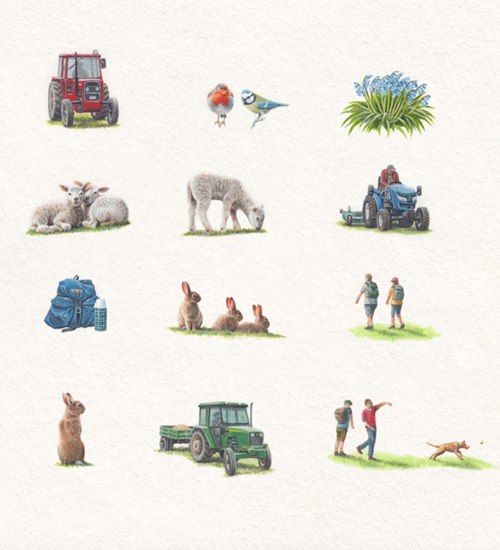
“The brief for this job was to refresh the existing design without spoiling an already popular image. Because of this, any alterations had to be made very subtly. The idea was to give each of the variations of Yorkshire Tea – Decaf, Hard Water and the Original – its own unique identity,” says Andrew.
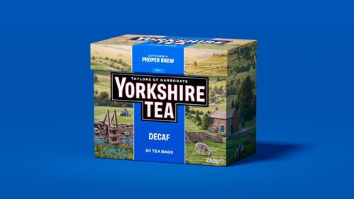
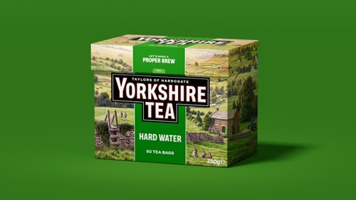
To achieve this, Andrew was commissioned to paint small additions and alterations to the original artwork based on the box colour for each product in the range. The Original box has a red surround, while Decaf is blue and the Hard Water box is colour coded green. Freshly painted elements using these highlight colours would be digitally inserted into the scene to create three separate variants of the same original artwork.
“For Decaf, blue bells, a blue rucksack and flask and a blue tit were chosen, whereas for the Hard Water, green ivy and a green tractor tie in with the colour theme. And variations were made in the foreground of each box by replacing the lamb with a different one on the Decaf and with rabbits on the Hard Water,” says Andrew.
He continues: “Only a couple of tiny alterations were made to the Original box – a cricket ball and a robin. Customers do study these images very closely and I think part of the idea was to give them some new elements to look for.”
Andrew paints traditionally using acrylic on a hot press watercolour board, which seems to suite the ‘proper’ theme perfectly. The artwork was then scanned by his wife, Louise, before being sent on to the designers at the agency as digital files.
The original landscape is an idealised, non-specific setting in Yorkshire, which Andrew imagined based on his knowledge of the countryside in the county. For the refresh, Turner Duckworth suggested a list of elements to incorporate into each of the three variant boxes, but were open to Andrew’s suggestions, particularly on the wildlife.
Reflecting life in the Dales
“One of the elements they were keen to incorporate was a tractor in each image, reflecting the relevant brand colour,” he says. “Another aspect that the designers were keen to change was the cricket pitch. So, while the original box has a village cricket match in progress, the Hard Water design has dog walkers and hikers crossing the pitch and on the Decaf box there is a tractor mower doing some pitch maintenance.”
Consistency was key. Firstly, the tone of the original artwork had to be maintained across the new additions, so the lighting and colour had to be perfect. “I hope the warmth of the colours and intimacy of the design creates this comfortable feel,” says Andrew.
Secondly, everything had to be painted at the same size as the original artwork, one quarter up. For example, Andrew couldn’t paint the tractors at A4 or A3 size then reduce them down – the brush strokes needed to match those across the entire scene. This meant the vehicles were painted no larger than a thumbnail.
“Although I am a miniature painter, something like an ivy leaf, a bluebell and even some of the figures were so small I could not have done them without using a large magnifying lens,” says Andrew. “I particularly enjoyed working on the ivy that drapes over the wall of the Hard Water box and was particularly pleased that it sat so well in the picture.”
As with the original brief all those years ago, the collaborative process was supportive and open-minded, and once Andrew’s roughs had been approved, the designers at Turner Duckworth trusted him to get on with the painting.
Naturally, Andrew himself enjoys a cuppa while he paints. “I drink Yorkshire Tea and always have a brew when I am working. Tea-time usually starts at 10:30 when everything stops for Ken Bruce’s Popmaster quiz,” he says. “I was delighted with this job and it’s always a special thrill when you see your artwork on the supermarket shelves.”
There’s an Easter Egg in the artwork for nature lovers as well. Look carefully and you’ll be able to spot a tiny little stoat in one of the panels – Andrew’s signature and a personal touch that the designers loved. The new box art will be rolled out during 2026.
Iratxe López de Munáin illustrates an interactive art kit on the life of a Master Impressionist.
Iratxe teamed up with Thames & Hudson UK to bring The Artist Box: Claude Monet vividly to life through her lively, colourful illustrations.
Designed as part of the 'Gift Lab' series, this engaging 24‑page activity kit immerses young audiences in Monet’s world. It features a 150-piece jigsaw puzzle of his Giverny garden, a fact‑filled fold‑out timeline tracing his life and personal dramas, twenty‑four creative art activities (from origami water lilies to a Monet-themed mystery), and even an iron‑on patch - all richly illustrated by Iratxe.
Opening the box reveals not only a puzzle where you can spot Monet’s studio boat, wife Camille, and characters from his famous paintings, but also invites users to experiment with his artistic techniques via fun hands-on prompts. Iratxe’s illustrations transform educational content into a playful, tactile journey that both celebrates Monet’s legacy and encourages budding artists to explore creativity in a memorable, interactive format.
Svetlana Molodchenko has been recognized with a Communication Arts Illustration 2026 Award of Excellence for her Williams Sonoma commission, Dream Store Pattern.
For this project, she created a fully vector, continuous pattern capturing multi-level rooms, staircases, and shelves filled with the brand’s real catalogue products, layering detail to evoke the charm of a whimsical, immersive store.
The artwork now adorns packaging, kitchenware, and tabletop items, translating her meticulous compositions into everyday experiences.
The award highlights Svetlana’s inventive approach, celebrating how her illustrative precision brings narrative to a commercial canvas.
Bringing medieval mysticism to contemporary hands, Victoria Fomina illustrates tarot for CICO Books.
Victoria’s commission for The Green Witchery Tarot combines 78 tarot cards with a 64-page illustrated guidebook, rooted in medieval symbolism and age-old witchcraft insights.
She drew each image by hand - acrylic, ink, pen, and coloured paper, paring detail to distill archetypes like the Lovers, Death, Hermit, and Magician into striking, mysterious forms.
The deck and book are designed to complement contemporary green witchery practices, connecting natural magic with visual clarity.
Svetlana Molodchenko designs two silk scarves for Harrods, translating jewellery archives into wearable lace.
Svetlana worked with Harrods to create ornate scarf designs, complete with borders that allow the patterns to shift, frame and combine.
Lace Print draws directly from archival jewellery illustrations, assembling gem-studded bees and floral fragments into a dense ornamental field that softens as the silk moves.
Gilded Butterfly Print introduces contrast, pairing a structured floral lattice with butterflies rendered as faceted adornments, poised between delicacy and weight.
On fabric, the work behaves like fine jewellery itself: precise, luminous, and designed to catch the eye differently with every fold.
Quarto Books commissioned Carolina to create the portrait illustrations for Billie Eilish is Life by Kathleen Perricone, part of the Modern Icons Series.
Carolina’s vibrant artwork complements the book’s celebration of Billie Eilish’s life, career, and cultural impact, bringing her music, style, and personality to life for fans old and new.
From early hits like Ocean Eyes to award-winning tracks for No Time to Die and Barbie, the illustrated guide captures the artist’s fearless creativity and wide-ranging achievements.
From breakfast to bedtime, Hao Hao’s art makes chemistry feel familiar and fun.
For Elements of the Day published by HarperCollins’ Red Shed imprint, Hao Hao teamed up with author Samantha Lewis to make the building blocks of the universe feel familiar and fun for young readers.
The hardback uses vibrant colour art to show how chemical elements are part of everything children see, touch and taste from waking up to going to bed. Hao’s designs turn moments like breakfast cereal or sand on the beach into playful, easy-to-grasp visuals that connect sensory experience with scientific ideas.
Her work adds warmth and clarity to the book’s curious, fact-rich journey through the day, inviting both kids and adults to see science in the everyday.

 – Svetlana Moldochenko – FairyLoot (Illustration Ltd, publishing)")
 – Svetlana Moldochenko – FairyLoot (Illustration Ltd, publishing)")
 – Svetlana Moldochenko – FairyLoot (Illustration Ltd, publishing)")
")
")
 – Iratxe López de Munáin for Thames & Hudson UK (Illustration Ltd)")
")
")
")
")
")
")
")
")
")
")
")
")
")
")
")
")
")