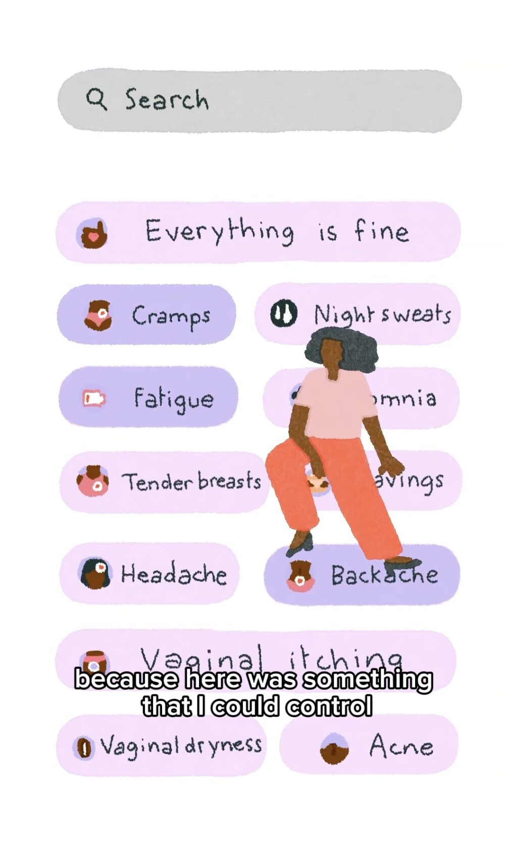
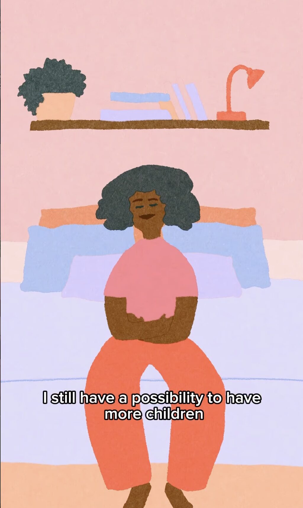
Phosphor's Léon Moh-Cah recently completed another animation project, this time for Flo, an app which helps you track your menstrual cycle. Léon was sent the audio story of one Flo user and asked to create an animation to visualise the story, which was used on Flo's social media. The video beautifully illustrates one Flo user's unique experience of how the app helped her.
Léon Moh-Cah is a French 2D animator and sketch artist, interested in the beauty of everyday life. Her practice, mixing digital and traditional techniques, uses daily observation and travels as a main source of inspiration. After completing BAs in graphic design and animation in Paris, Léon went on to study an Animation Masters at the Royal College of Art. Léon's animations have been screened and won awards across the world and she has worked for clients such as Ted-Ed, The School of Life and The Standard Hotel.
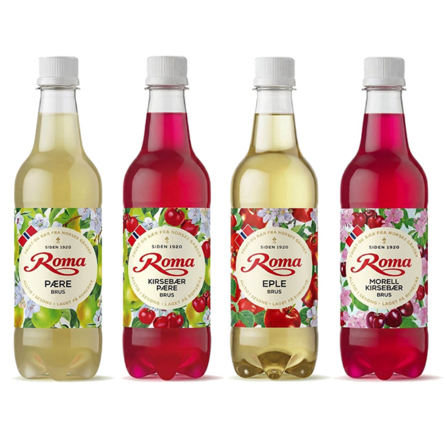
We’re delighted to share Mary Woodin’s latest gorgeous illustrations, a dream project for a keen gardener…and commissioned at the perfect time of year for Mary to be able to gather reference from her own fruit trees. Always a bonus!
The brief was to paint perfectly ripe fruit in thirst quenching fresh colours.
The aim, to convey the quality of the ingredients in the fruit drinks produced by Norwegian company Roma who have crafted their business over the past 100 years.
Chris Skinner was commissioned by the BBC to create the key art for their new comedy series Ann Droid, starring Diane Morgan and Sue Johnston. The image is being used across all print and digital platforms for promotion of the series.
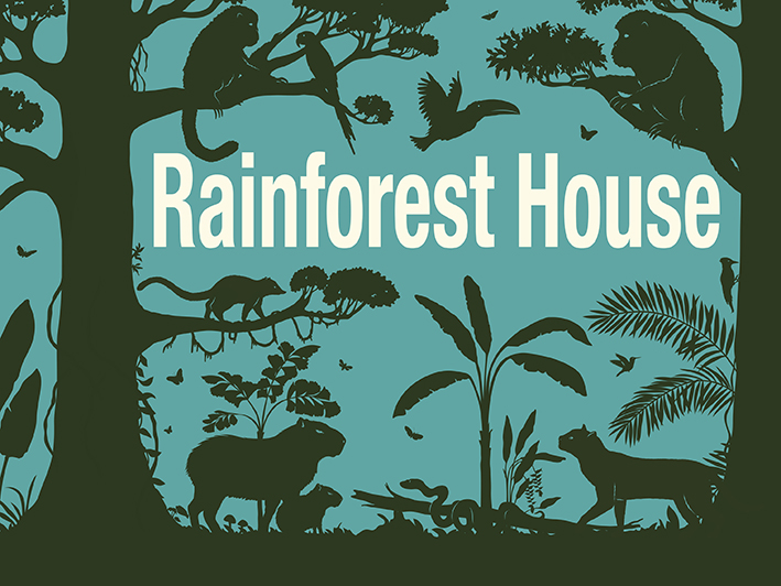
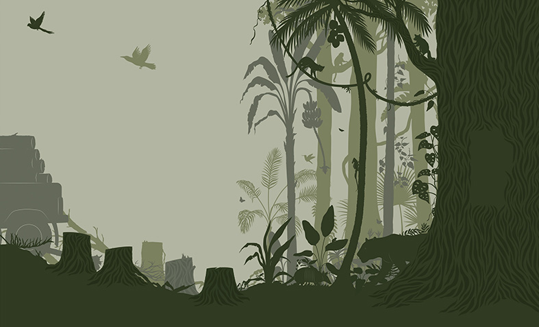
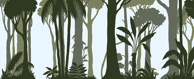
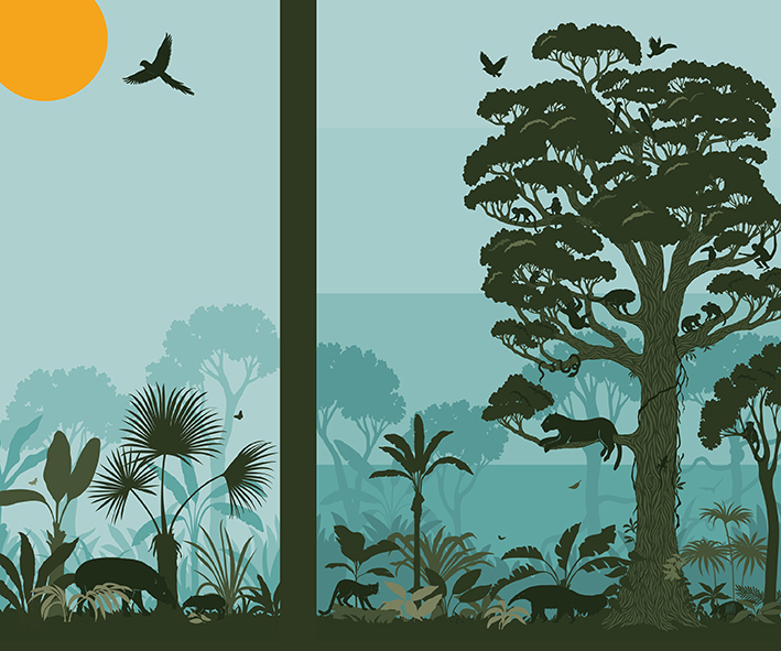
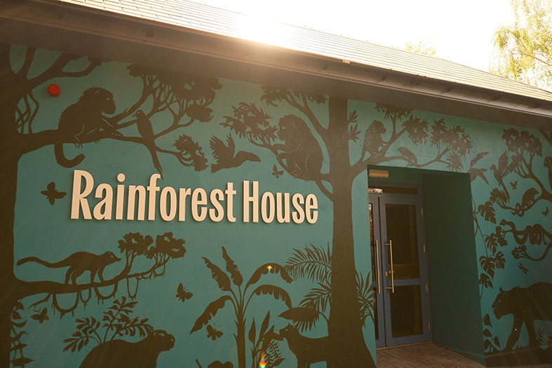
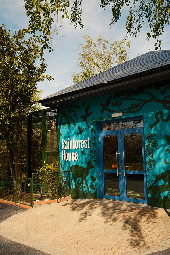
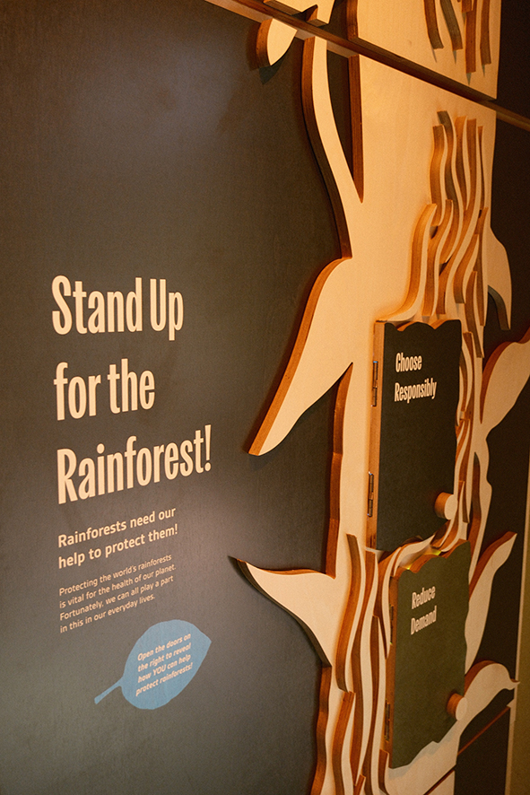
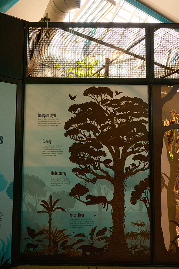
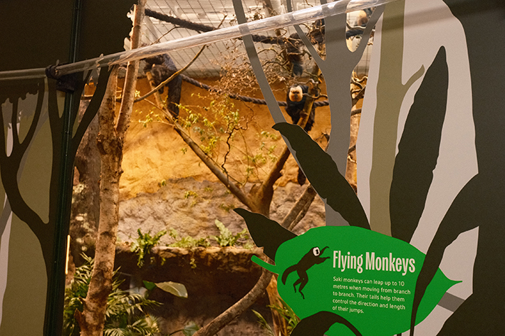
Laura brought the wildness of the inside to the outside in this exciting project for Dublin Zoo’s Rainforest House.
Working with Bright design agency Laura illustrated several large scale pieces as well as infographics to decorate and inform visitors. With interactive elements and displays, Laura’s distinctive style unified the various elements of the project and created a beautiful environment for the reinvention of the Rainforest House. Her work now adorns the walls of the house itself, internal elements and branded materials as well as glass decals for the animal enclosures. The house has a living rainforest inside where visitors can immerse themselves with the inhabitants!
The mural for the exterior of the building, illustrated by Laura, was brought to life on the walls themselves by mural artist @wallartbyalexandra
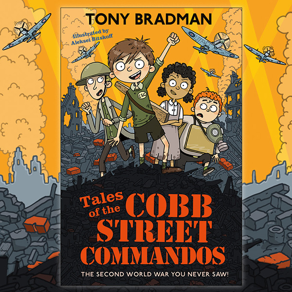
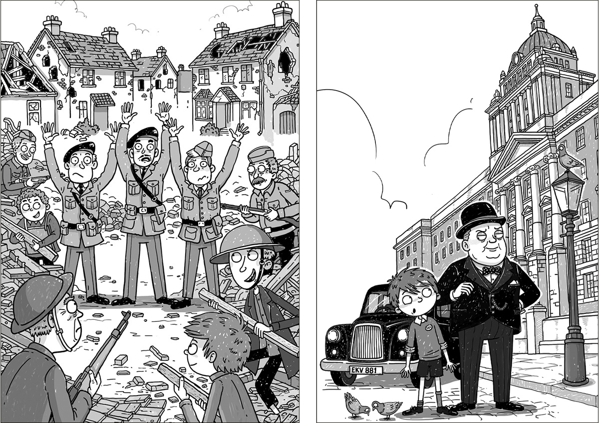
Published this month by Faber, Tales of the Cobb Street Commandos is a fact-filled, funny wartime adventure written by Tony Bradman, with cover and internal illustrations by Aleksei Bitskoff.
Set in London's East End in 1941, the story follows Jimmy and his friends as they form a top-secret commando unit determined to do their bit for the war effort - training in abandoned warehouses, raising money for Spitfires, and even landing a daring mission to meet Winston Churchill himself.
Aleksei Bitskoff’s energetic line work and instinct for comic timing make the Commandos leap off the page, while his eye for historical detail gives the book its real sense of place and period. Known for his intricate, humorous style, his client list includes the bestselling Little Bad Man and Who Let the Gods Out series.
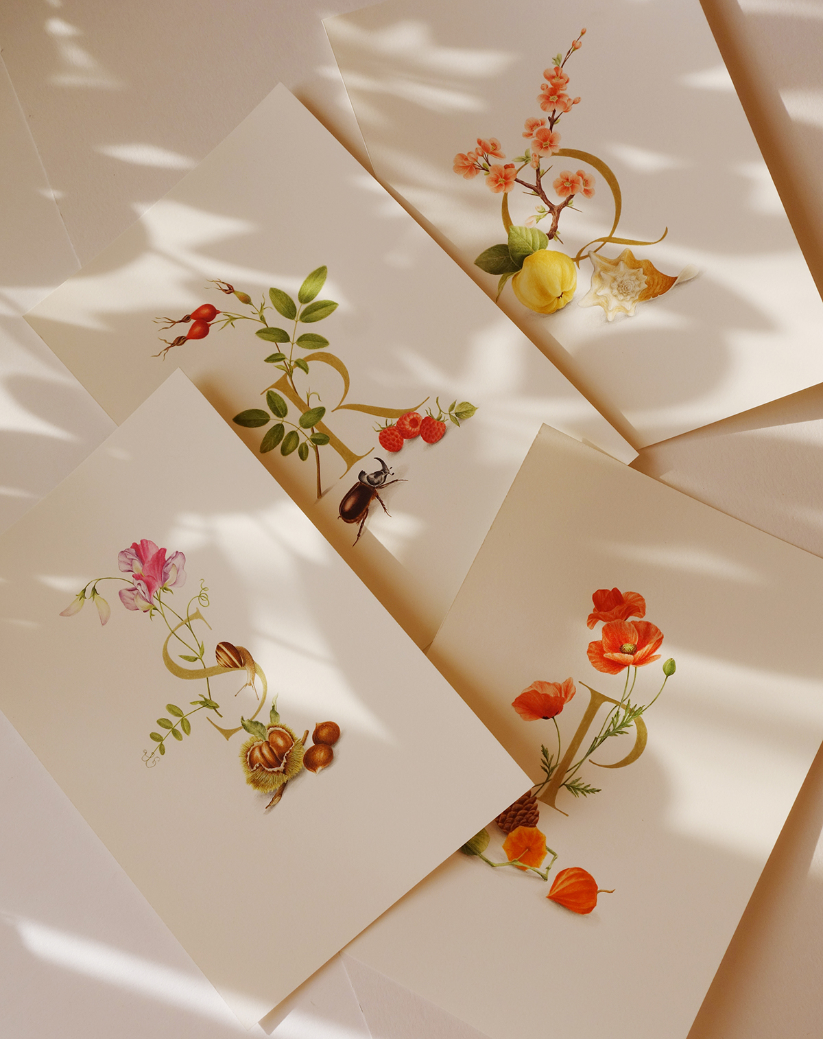
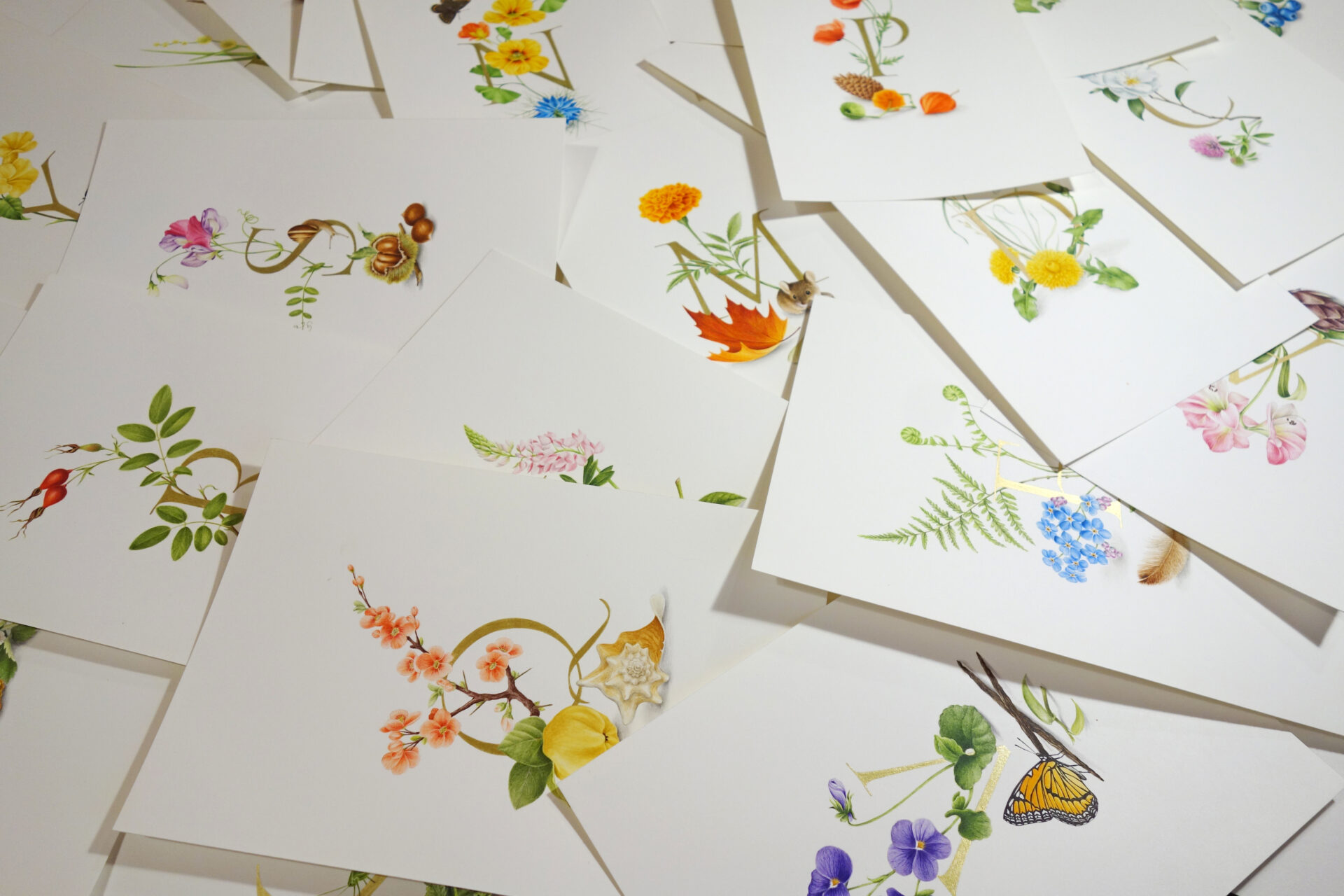
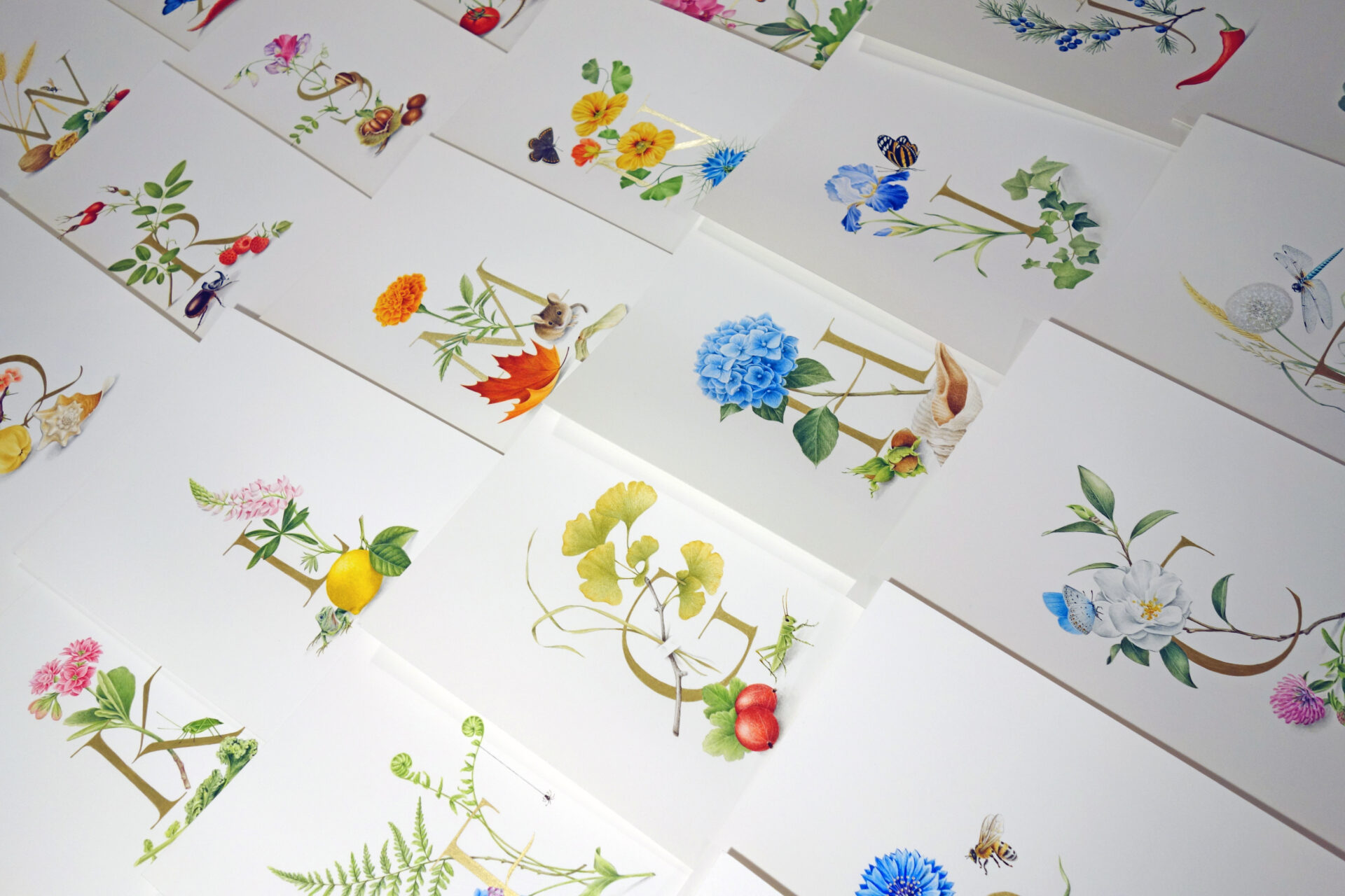
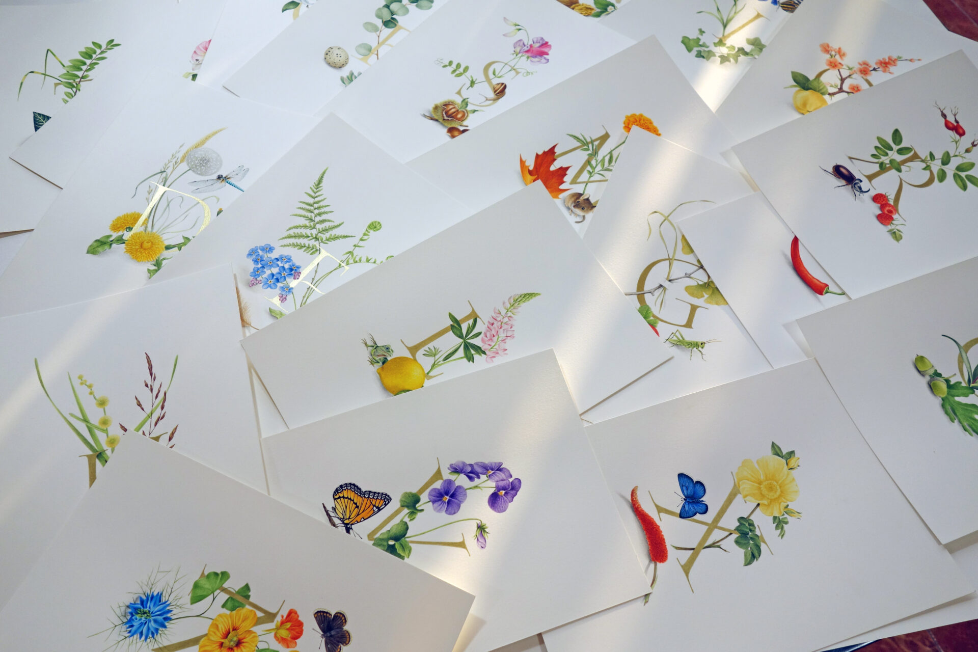
Armenia-based illustrator Svetlana Molodchenko creates a richly detailed illuminated alphabet for e-card company Jacquie Lawson.
Svetlana was commissioned to create an intricate hand-painted alphabet inspired by the natural world. Drawing influence from 'Mira calligraphiae monumenta' and the ornate illustrations of Joris Hoefnagel, Svetlana developed each letter as its own balanced composition, pairing flora and fauna with beauty and detail.
Amaryllis, artichoke and Adonis blue butterflies appear in 'A', while camellias, chestnuts and common blue butterflies form part of 'C'.
Created entirely by hand using traditional materials and illumination techniques, the project took several months to complete, resulting in a collection that feels timeless and jewel-like.
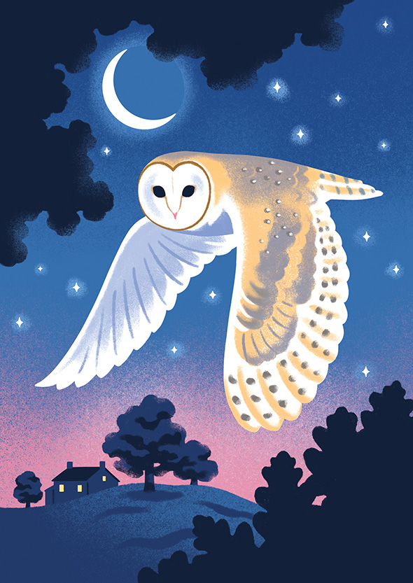
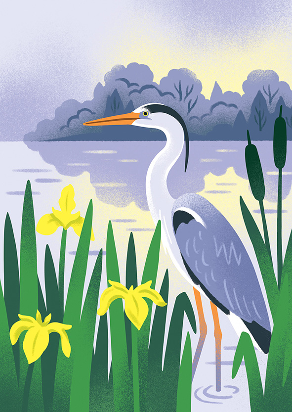
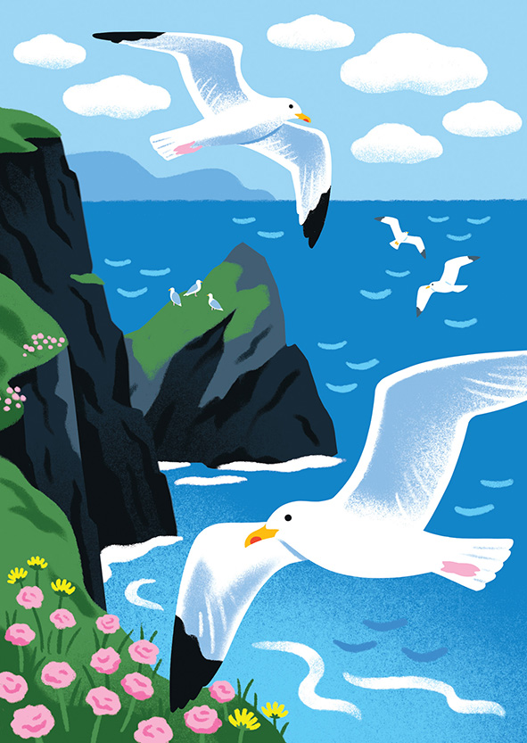
Lucy was commissioned to produce a set of beautiful bird illustrations for the ‘Flock’ card range with Stormy Knight Cards. Complete with gold foiled edging and details, they are a stunning set!
Lucy said: “I’m big into birds so this was a lovely commission for me. Herring gulls and swallows to start with, more to come!
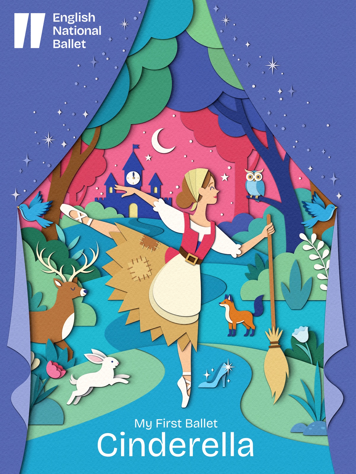
Zara Picken created the most magical illustration for the English National Ballet's production of My First Ballet: Cinderella. Used across the advertising, publicity and merchandise of the production, Zara’s theatrical paper-craft illustration is richly layered, capturing the charm of this beloved and timeless story in a visually powerful way.
British nature and wildlife illustrator Andrew Hutchinson gives the Yorkshire Tea packaging a refresh.
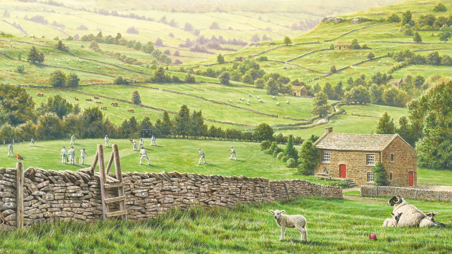
Back in 2011, Andrew Hutchinson painted an idyllic rural Yorkshire scene which has adorned the Yorkshire Tea box ever since. With a refresh of the brand taking place across 2025 and 2026, branding agency Turner Duckworth commissioned Andrew to refine the popular image by adding and altering some of its elements to fine tune the packaging for two product variants. We asked Andrew about the variety of tiny paintings he created for the refresh and the creative decisions made along the way.
How did this project come about?
I produced the existing Yorkshire Tea box illustration back in 2011 when the company decided they wanted to redesign their box without losing the very strong overall Yorkshire Tea look. Turner Duckworth approached me via my agency, IllustrationX, in 2024 regarding the refresh.
What was the brief?
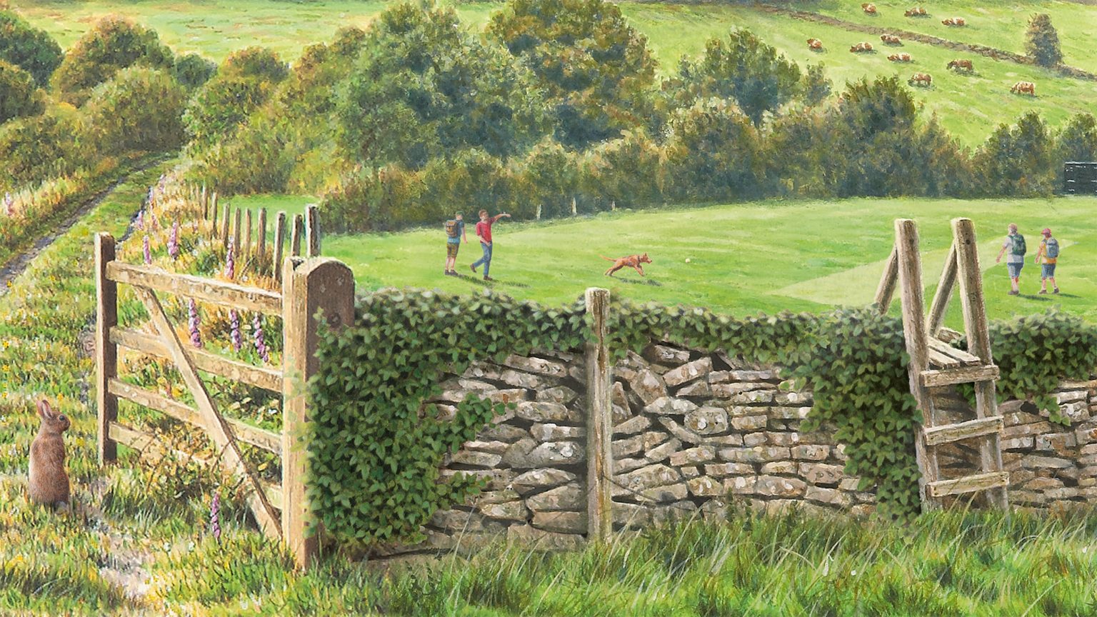
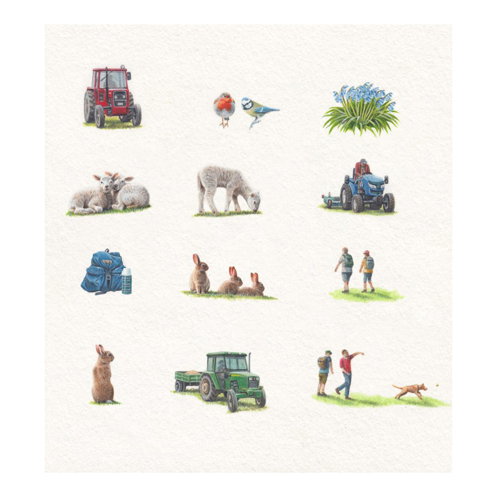
The brief for this job was to refresh the existing design without spoiling an already popular image. Because of this, any alterations had to be made very subtly. The idea was to give each of the variations of Yorkshire Tea – Decaf, Hard Water and the Original – its own unique identity. A selection of small additions, themed around the branding colour of each tea variation – red for Original, blue for Decaf and green for Hard Water – would be painted, which could be sensitively inserted into the design. For Decaf, blue bells, a blue rucksack and flask and a blue tit were chosen; for the Hard Water, green ivy and a green tractor tie in with the colour theme. Variations were made in the foreground of each box by replacing the lamb with a different one on the Decaf and with rabbits for the Hard Water. Only a couple of tiny alterations were made to the Original box – a cricket ball and a robin. Customers do study these images very closely and I think part of the idea was to give them some new elements to look for.
What was it like to receive this brief?
I was very proud to be asked to work on this design again. Working with Yorkshire Tea has certainly been a career highlight.
What media and tools did you use?
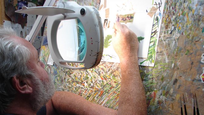
I only use a brush and paint – no computers! The paints I use are acrylic and I paint on a hot press watercolour board. Once completed, my wife Louise scanned the artwork and sent it directly to the designers as digital files.
How was the content of the images decided upon?
The landscape of the box has remained the same as the original and was based on a variety of areas of Yorkshire selected to create a single non-specific Yorkshire landscape. For this job, the designers gave a very clear brief of the alterations they wanted to make and had a list of suggested elements to incorporate but were equally open to any suggestions or comments that I had, particularly about the wildlife elements. One of the elements they were particularly keen to incorporate was a tractor in each image, reflecting the relevant brand colour. Another aspect that the designers were keen to change was the cricket pitch. So, while the original box has a village cricket match in progress, the Hard Water design has dog walkers and hikers crossing the pitch and on the Decaf box there is a tractor mower doing some pitch maintenance.
The tone is relaxing, like having a cup of tea. How did you conjure this feeling?
The lighting and colour had to remain consistent from the original box and across the three designs, so any additions obviously had to tie in with this. I hope the warmth of the colours and intimacy of the design creates this comfortable feel.
Tell us about the little stoat?
The stoat was not particular to these designs but has appeared on all my Yorkshire Tea boxes – my signature if you like. I always try to include some animals in the artwork and stoats love dry-stone walls. It was a bit of a last-minute addition on the original design and could have been painted out but, as it was, the designers loved it and it stayed. All the artwork I produced for the additions was done on white for the designers to incorporate into the images digitally.
What were the main challenges?
All the additions made to the box, for consistency, had to be painted at the same size as the original artwork; one quarter up. This meant that some of the elements were tiny with the tractors being no bigger than my thumbnail. And, although I am a miniature painter, something like an ivy leaf, a bluebell and even some of the figures were so small I could not have done them without using a large magnifying lens.
What were your favourite elements to paint?
I particularly enjoyed working on the ivy that drapes over the wall of the Hard Water box and was particularly pleased that it sat so well in the picture.
What was the collaborative process like?
All the designers I have worked with over the years on Yorkshire projects have been a pleasure to work with; supportive and open-minded. And once the roughs had been approved were always great at leaving me just to get on with my painting.
And do you enjoy a cuppa while working?
Of course, I drink Yorkshire Tea and always have a brew when I am working. Tea-time usually starts at 10:30 when everything stops for Ken Bruce’s Popmaster quiz.
What’s your verdict on the outcome?
I was delighted with this job and it’s always a special thrill when you see your artwork on the supermarket shelves.
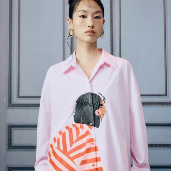
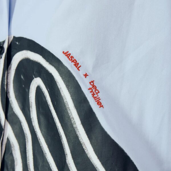
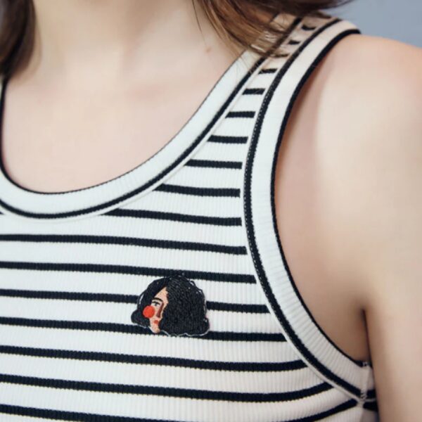
Take a look at this Fabulous Fashion collaboration between Bea Müller and Jaspal featuring Bea's signature illustrations across a range of fashion garments and accessories. Featuring Bea’s signature style, the collection is available for purchase now.





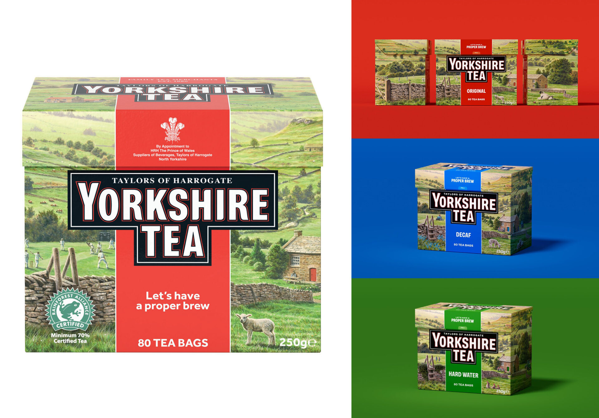 British nature and wildlife illustrator Andrew Hutchinson gives the Yorkshire Tea packaging a refresh.