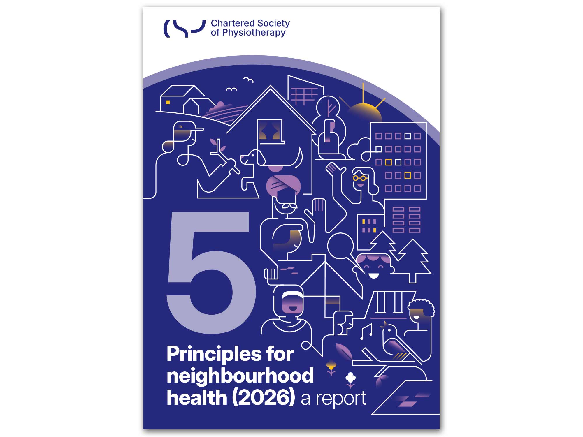
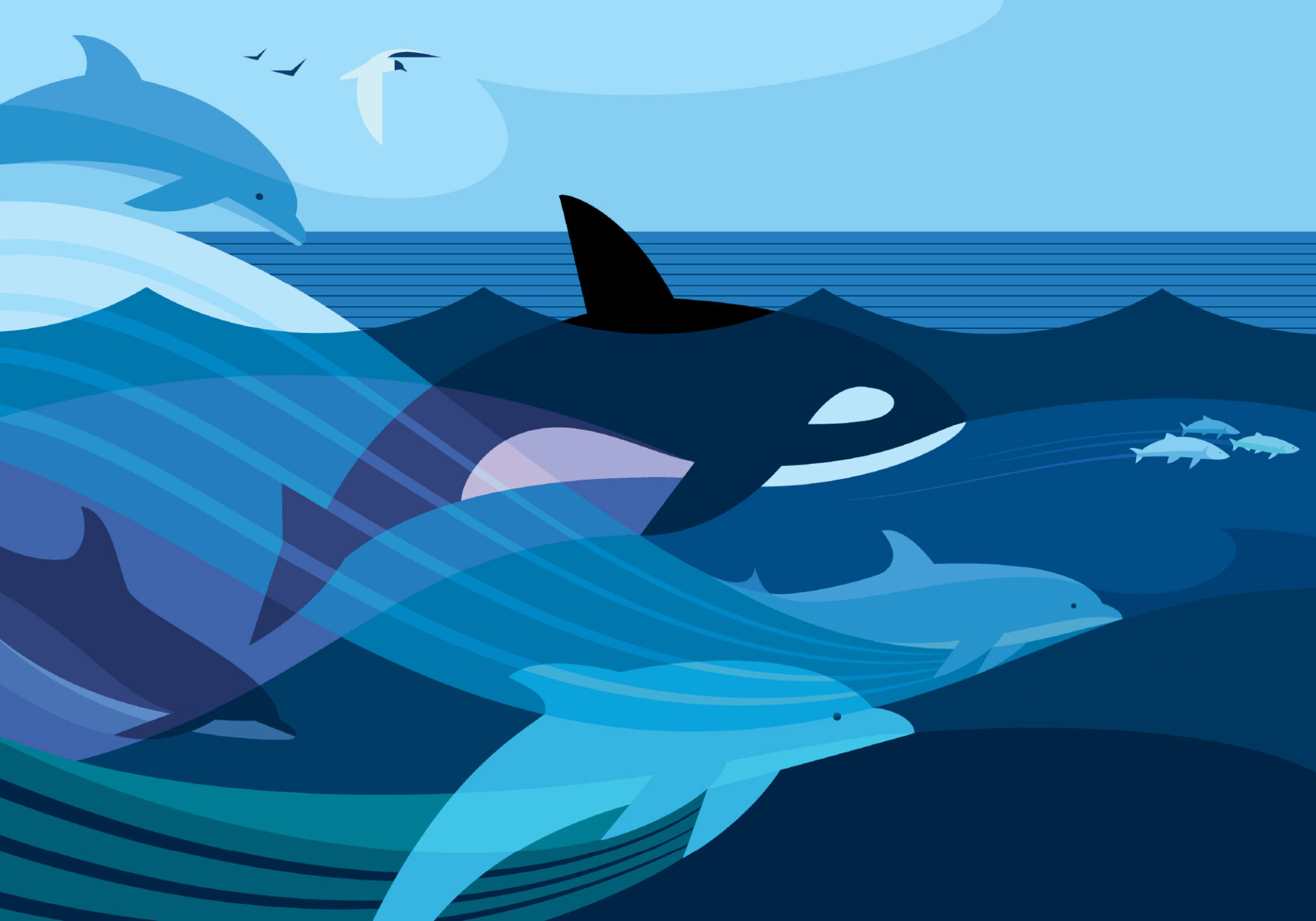
Diarmuid was commissioned by the designers at the Chartered Society of Physiotherapy to create this stunning cover for their latest report entitled 5 Principles for Neighbourhood Health 2026. He also artworked chapter headers for each of the five subjects.
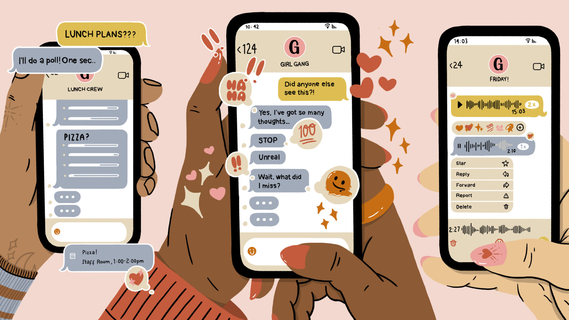
Sophie Parsons was thrilled to illustrate US Glamour Magazine's Group Chat series.
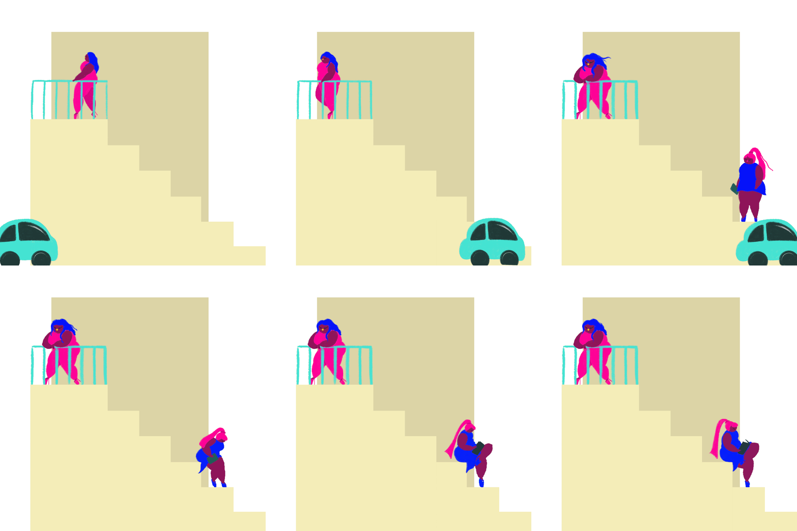
Working in her colourful and contemporary style, Sophie created a collection of stills and animated GIFs to bring the features to life; exploring the etiquette, unspoken rules and shifting power dynamics of the group chats that shape our modern friendships.
Sophie's character-focused illustrations tap into the human experience beautifully. Her images are always full of narrative, and she is able to elevate the relationship between word and image with her considered use of line, colour and scene building.
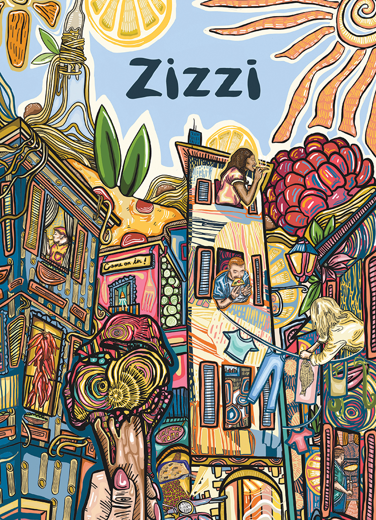
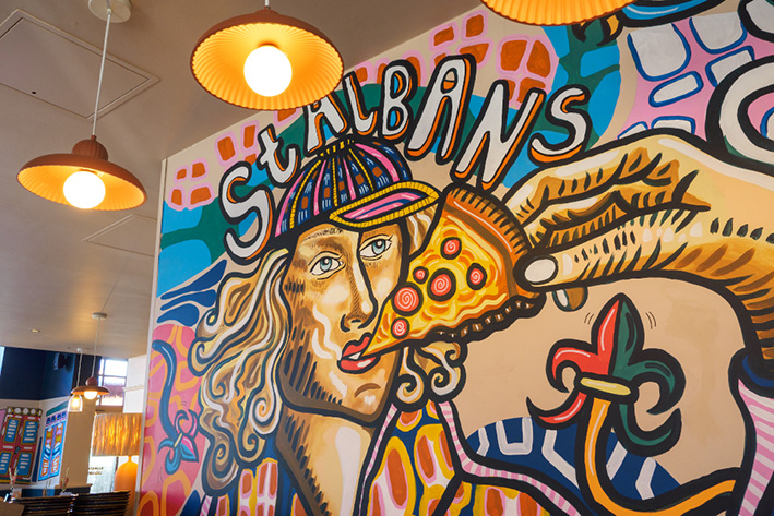
We’re very excited to introduce our latest signing, the fabulous and fun artwork of Brianna Chartrand!
With a unique and eye catching style perfect for menus, packaging and murals, we can’t wait to see where her work will take her next. Welcome to the team Bri!
Head to her portfolio page to check out more of her work.
Chris Skinner was commissioned by the BBC to create the key art for their new comedy series Ann Droid, starring Diane Morgan and Sue Johnston. The image is being used across all print and digital platforms for promotion of the series.
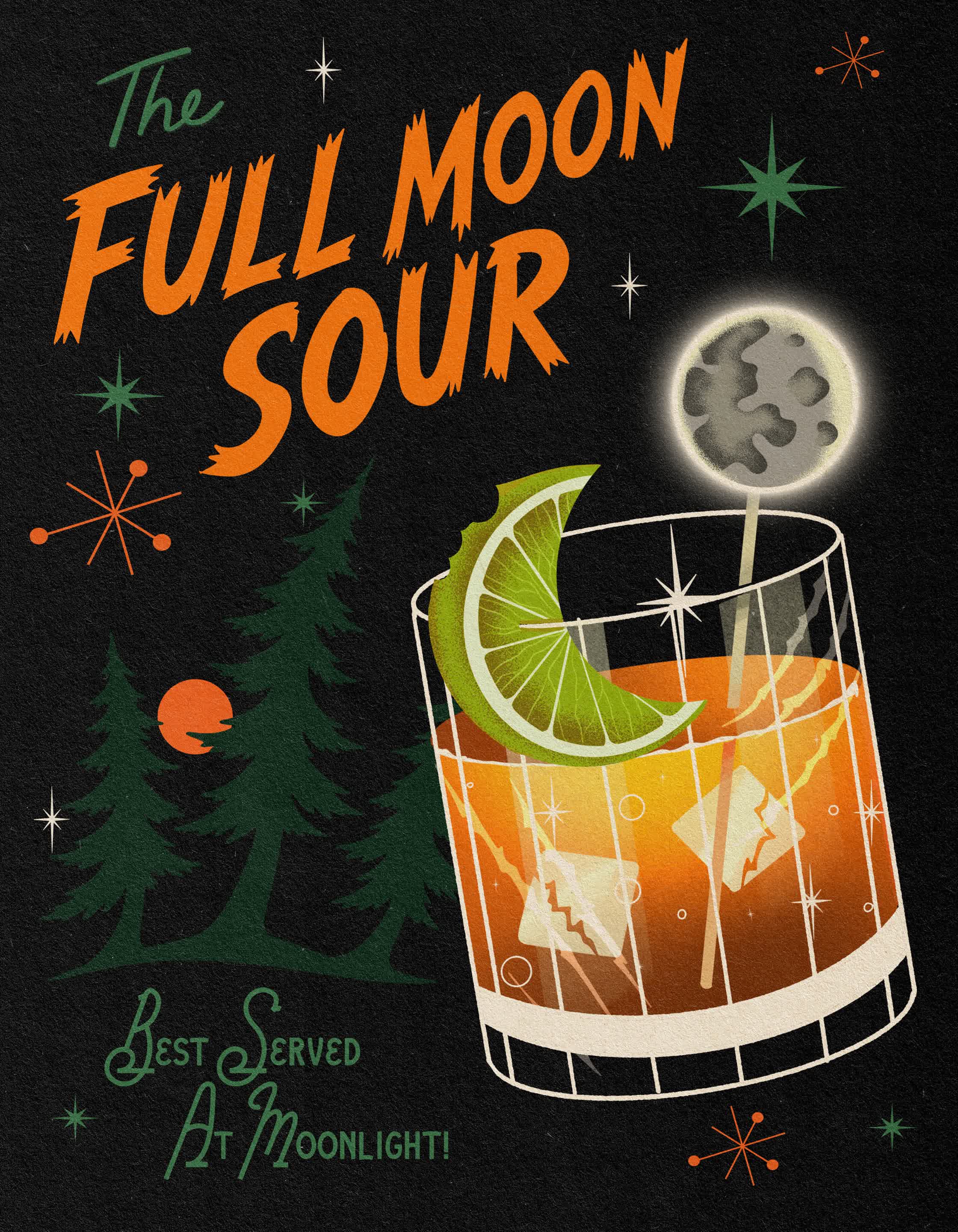
Monster Cocktails is an ongoing personal series that reimagines classic movie monsters as elegant vintage cocktails.
Inspired by mid-century advertising, retro bar menus, and classic horror cinema, each Monster Cocktail piece blends playful nostalgia with a touch of the macabre, celebrating iconic horror characters through bold color, graphic shapes, and stylized illustration.
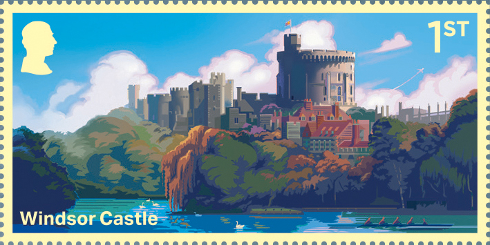
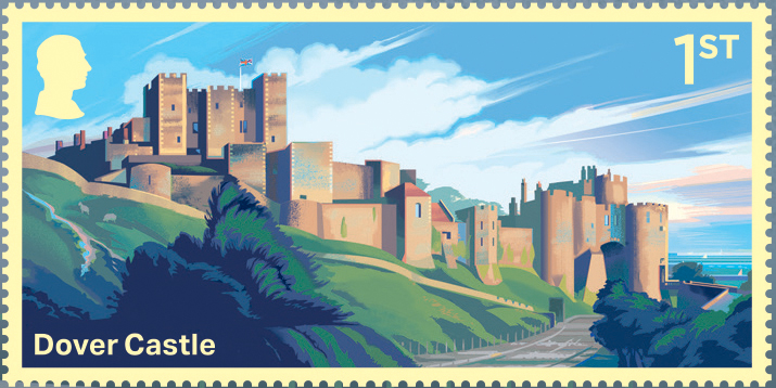
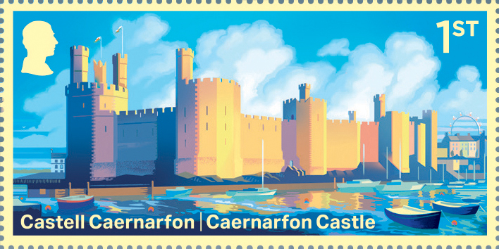
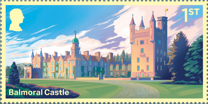
Rob’s magnificent Castle stamps for Royal Mail, featuring Caernarfon, Windsor, Dover and Balmoral.
Working with Chris at Studio Up, Rob illustrated these four magnificent castles for the Miniature Sheet. A reminder of these amazing buildings and the many stories through history that they hold.
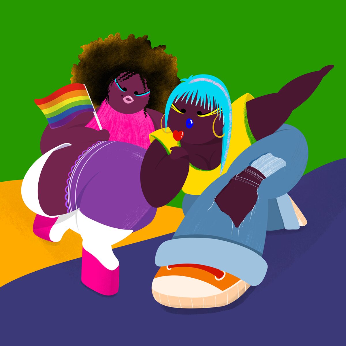
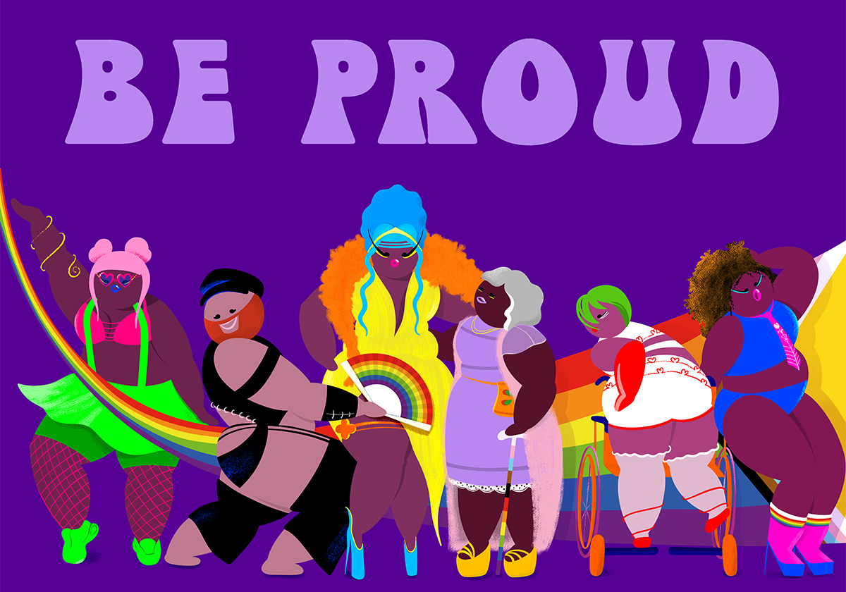
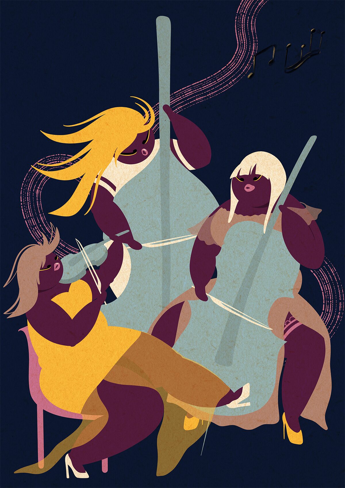
The Phosphor team is proud to welcome Marta Liébana Martínez. Marta is a Spanish illustrator based in Amsterdam, known for her bold compositions, feminine characters and vibrant visual language.
Her work combines playful energy with emotional sensitivity, creating expressive images that feel confident, colourful and full of personality.
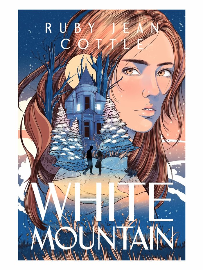
Carolina Rodriguez Fuenmayor illustrates her second book in Ruby Jean Cottle’s Black River duology, commissioned by Simon & Schuster through Atria Books.
There’s a restless feeling running through Carolina Fuenmayor’s new cover for the final instalment of the Black River duology.
Made for Atria Books ahead of the novel’s September 2026 release, the piece leans into the tension at the centre of the story: desire tangled up with fear, loyalty shadowed by secrecy.
This is vampire fiction at its most emotional - the cover settles naturally into the darker, romantic tone that has shaped the books from the beginning.
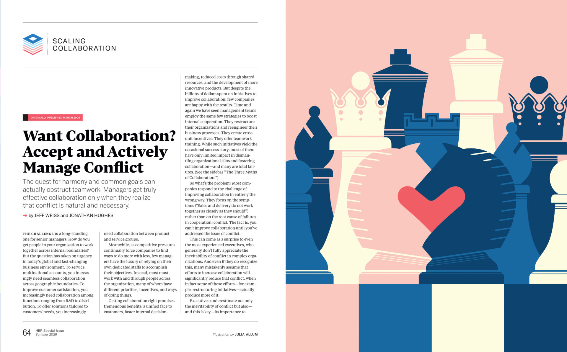
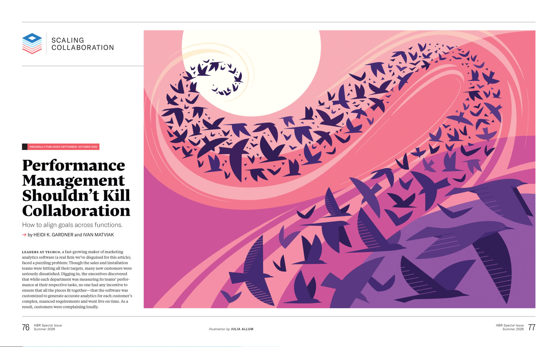
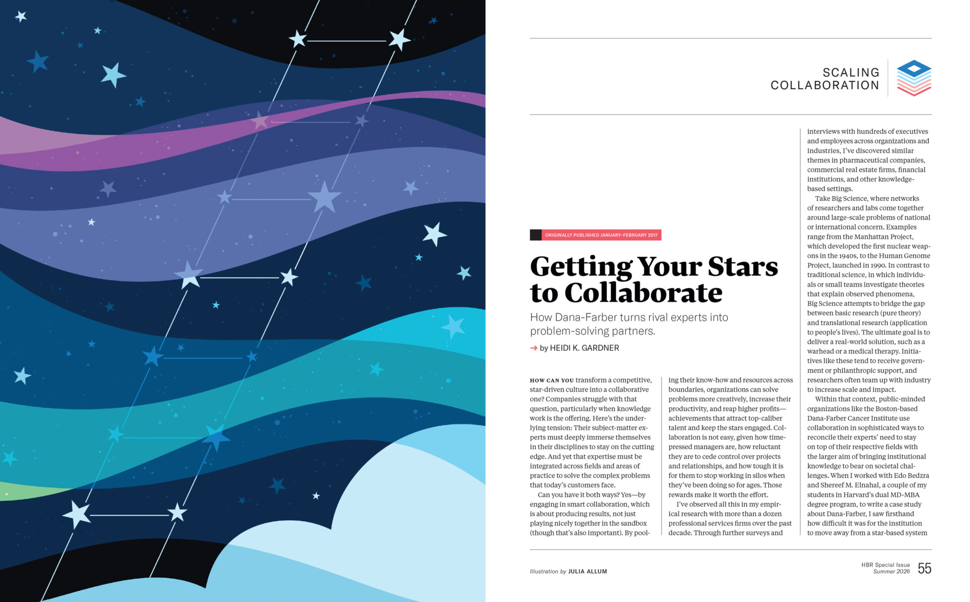
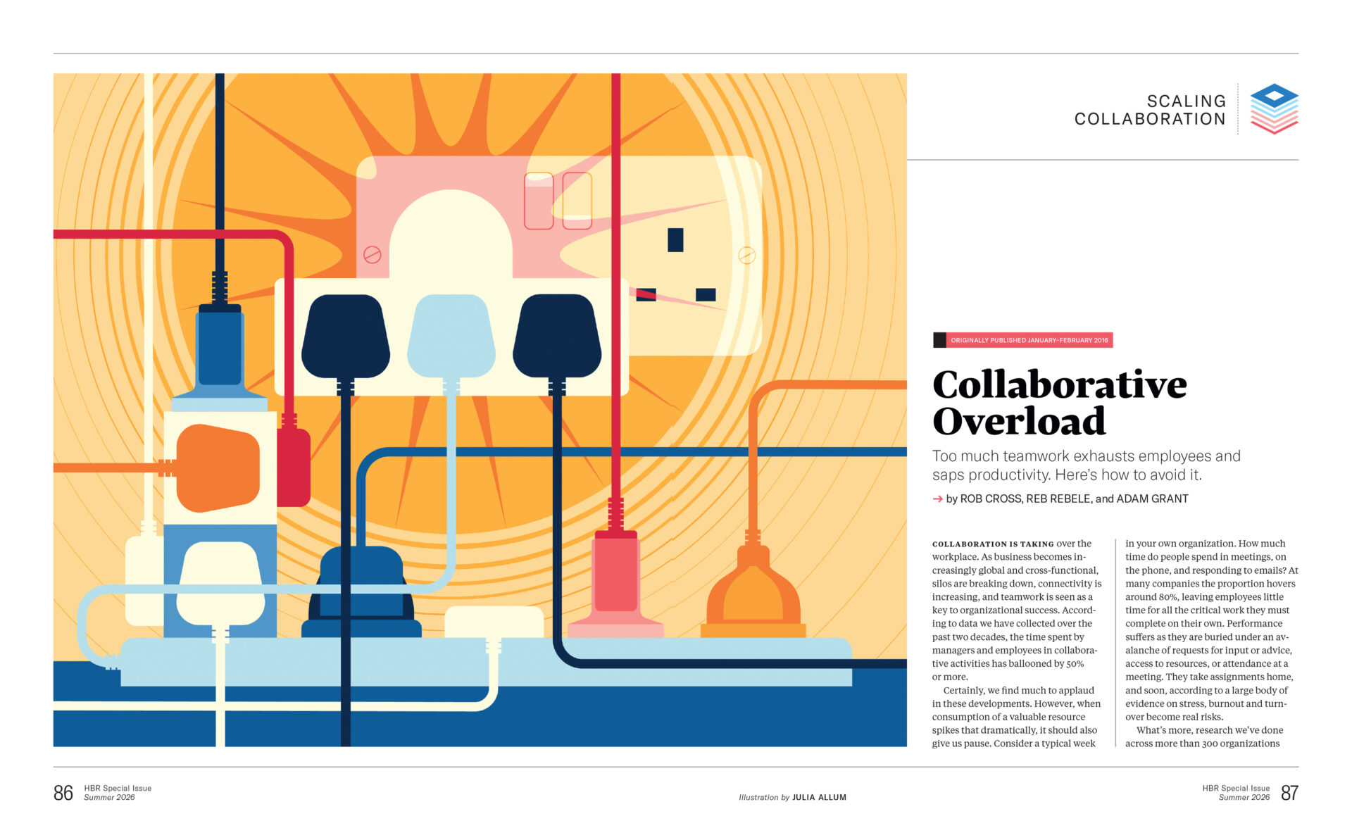
Commissioned by the team at Harvard Business Review for a special issue on How to Collaborate Better, Julia developed a collection of concept-driven illustrations in her distinctive minimalist style. With her trademark use of scale and visual metaphor, Julia’s illustrations explore the different aspects of collaboration with clarity and wit.
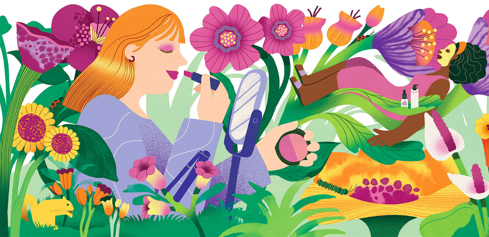
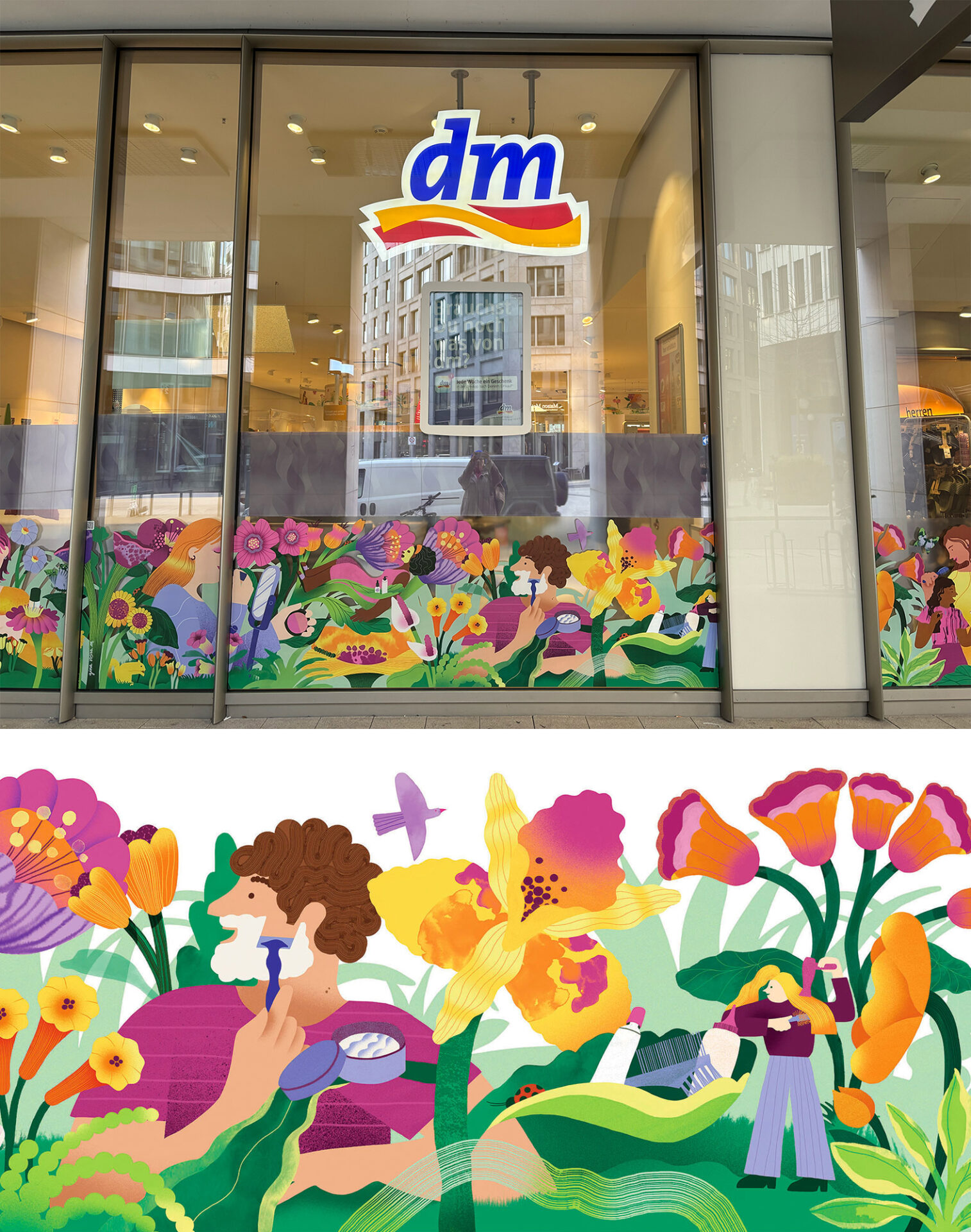
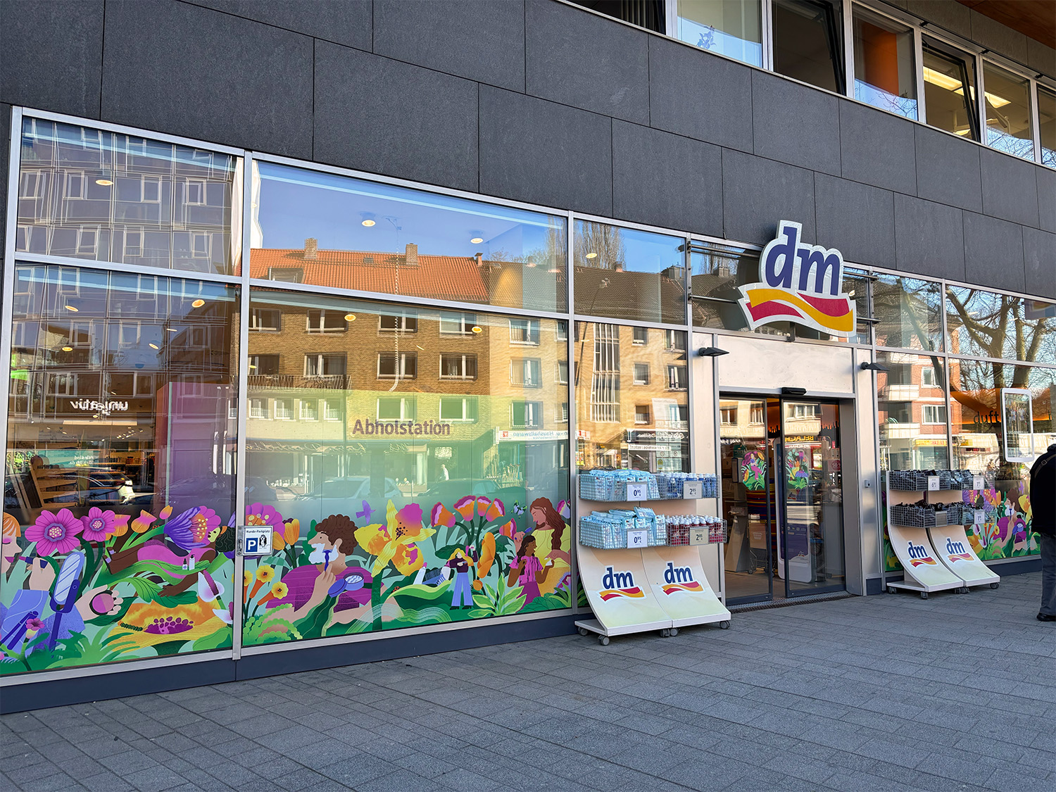
Colombian artist Gina has developed a full illustration system for dm-drogerie markt’s Spring 2026 campaign, Garden of Transformation, displayed across more than 2,000 stores nationwide in Germany.
The commission forms part of dm’s rotating artist programme, which invites a different illustrator every four months to reinterpret the brand’s visual identity at scale - Gina is the first Latin American artist selected for the series, extending its cultural and visual range.
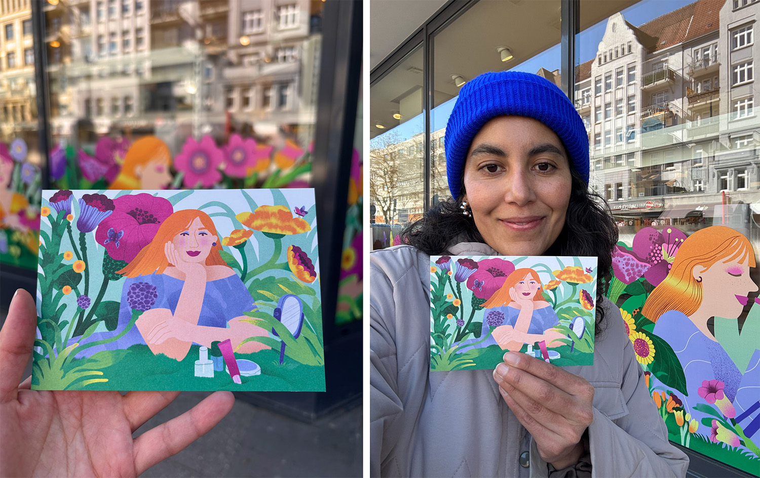
Her concept transforms everyday retail environments into living ecosystems, where objects and beauty spaces evolve into organic, blooming forms. The campaign spans storefront façades, posters, postcards, shopping bags, and in-store applications, running until 26 June 2026 and unifying dm’s seasonal presence through a cohesive illustrated world.
Gina says, "Working on this project alongside the design team and my agent has been a deeply enriching journey. Being able to combine analog and digital techniques and to contribute ideas that were ultimately considered for a brand of this scale, has been incredibly rewarding. This commission brings together many of the things I love both as an illustrator and as a person. I hope that those who encounter it feel energized by the colors, uplifted by the visuals, and carry with them a sense of joy and positive energy."