
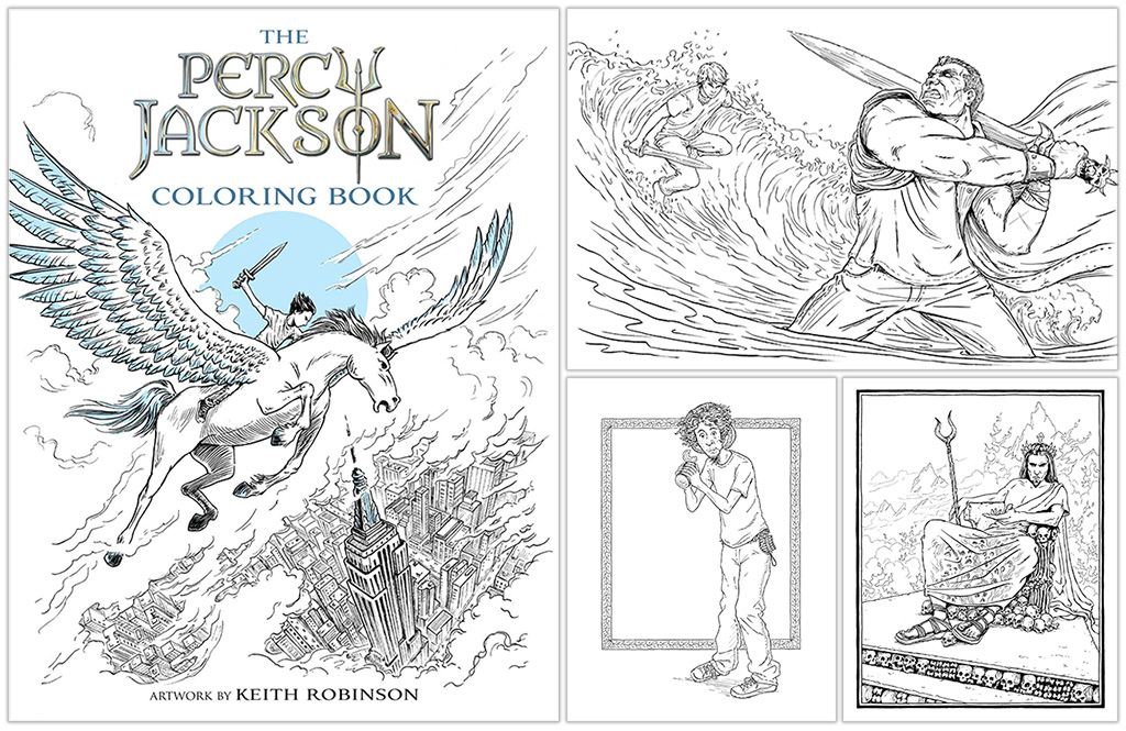
Behind the Book: The Percy Jackson Coloring Book by Keith Robinson
The older coloring book trend continues with Disney-Hyperion‘s The Percy Jackson Coloring Book, illustrated by Bright Artist Keith Robinson.
With a career that began in graphics and animation, to his current work as a children’s book illustrator, Robinson is somewhat of an Olympian himself. Here, he takes us inside the process of taking this cult fantasy series from his own imagination onto the page, telling the story of the beloved The Lightning Thief in an interactive way which Percy Jackson fans have never seen before.
Your latest project, The Percy Jackson Coloring Book, which goes on sale August 15th, is based on Rick Riordan‘s cult series, Percy Jackson and the Olympians. What was the research process like for this project as opposed to others you’ve done?
It was really exciting to have the opportunity to illustrate Percy Jackson’s adventures, but also a big responsibility. The series has a devoted fandom so I felt it was important to pay attention to detail. I began by reading the book, making notes and bookmarking key passages. I was given comprehensive briefing notes by Disney, but for each illustration I also went back to the text and read around the scene in question, to make sure I had an accurate image in my mind.
I brushed up on my greek mythology as well, and did quite a lot of research for things like ancient greek armor, architecture, decorative patterns and so on. I also gathered reference for several modern locations that appear in the book, like the
Metropolitan Museum of Art in New York.

Here is my well-thumbed copy of ‘The Lightning Thief’ and my old book of the original Perseus myths. (Confession time: this was from my junior school library and is now 38 years overdue. Oops!)
Take us through your process for how you created each image in the book. What medium did you use and how did you put it all together? How has this process differed from other projects you’ve done?
Disney had seen some of my line illustrations and thought that my style would translate well into the coloring book.
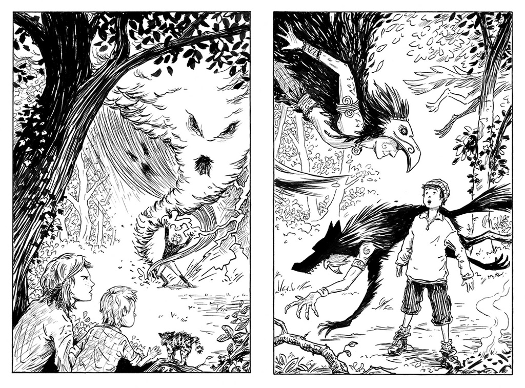
Interior illustrations by Keith from The Maloneys’ Magical Weatherbox by Nigel Quinlan
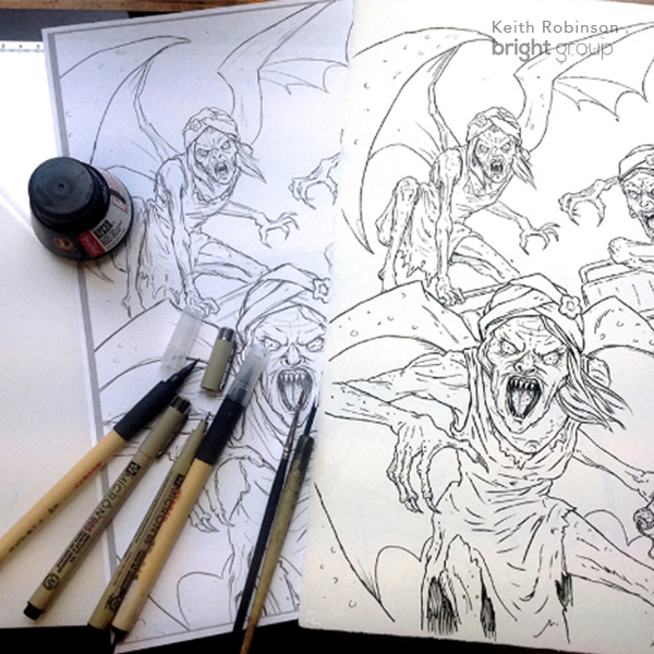
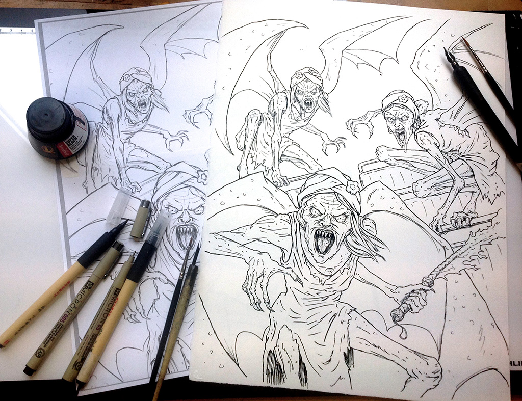
I love working in pen and ink, but this is my first coloring book. The big difference, of course, is that the illustrations have to be completely rendered in open line, with no tone or solid blacks. This presents its own challenges as you have to rely entirely on line weight to create form and depth.
There’s also nowhere to hide with this style of working. If there’s a hand in an awkward position, you can’t cheat by hiding it in the shadows! One of the things that attracted me to this project was that I thought it would be a great artistic work-out. Making over a hundred drawings in this way has taught me a lot about anatomy and figure drawing.
I began each scene with some rough thumbnail sketches to get the basic layout. Then I used these as the basis for a tighter digital sketch in Photoshop…
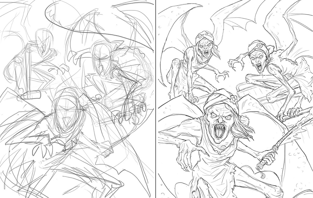
Rough sketch and finished sketch
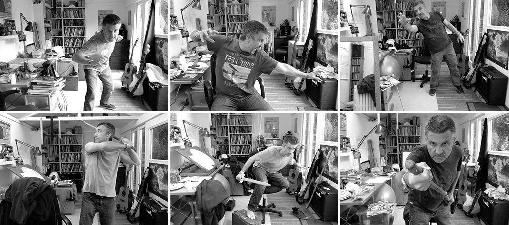
At this point I gathered any reference material needed. I often took photos of myself to get the poses right. I’ve got quite a collection of embarrassing selfies from this project!
To make the final drawings I used a lightbox to work over the detailed sketch. I drew with fine-liners and brush pens, as well as using dip-pens and brushes with India ink. These tools all make lines with very different characteristics, and combining them creates more interesting drawings I think. For example, a brush is good for rendering the flowing robes of a Greek god, whereas a scratchy nib is good for suggesting the leathery skin of a monster. Varying the quality and weight of the line can also suggest form and depth, taking the place of what I might otherwise achieve with tone.
You tell the entire story of The Lightning Thief, a wildly popular fantasy novel, through illustration. How did you remain loyal to the subject while also allowing yourself the creative freedom to do your best work?
The books have brilliant cover art by John Rocco and there have also been a couple of films, but I don’t think that Percy’s world is as definitively visualized in the popular imagination as something like, say Harry Potter. So while I was very mindful of doing something that I hope will resonate with fans, I didn’t feel tied to a particular look. I thought the best approach was to just immerse myself in the book and to interpret it in my own way.
I treated it like illustrating a novel, rather than making a coloring book. You know there’s that coloring book ‘look’ which can feel rather cold? I wanted to avoid that and just concentrate on making series of drawings that tell the story in a dynamic way. I certainly hope people will enjoy coloring them, but I tried to make illustrations that can be enjoyed in their own right as well.
Disney and Rick Riordan were fantastic to work with. They gave me a lot of creative freedom to come up with my own interpretation of the book and made only
very minor changes.
Before landing at Bright, your illustration career began in website design, animation, motion graphics, and digital media. Why the switch to children’s book illustration and how has your background in other types of art helped you in your current role?
It was more of a return to children’s illustration than a switch, really. I’d made a couple picture books at art college and that was definitely where my aspirations lay. But after graduating in 1992, I got swept up in the digital revolution that was just getting going back then. It was such an exciting, pioneering time and it was a way of combining all the things I was interested in; illustration, graphics, animation and this new fangled thing called ‘interactivity’! I worked at the BBC in the early days of digital, then formed a production company with some friends, where we did a bit of everything;
web, animation, and TV. When I’m not illustrating, I still keep my hand in as a freelance animator.