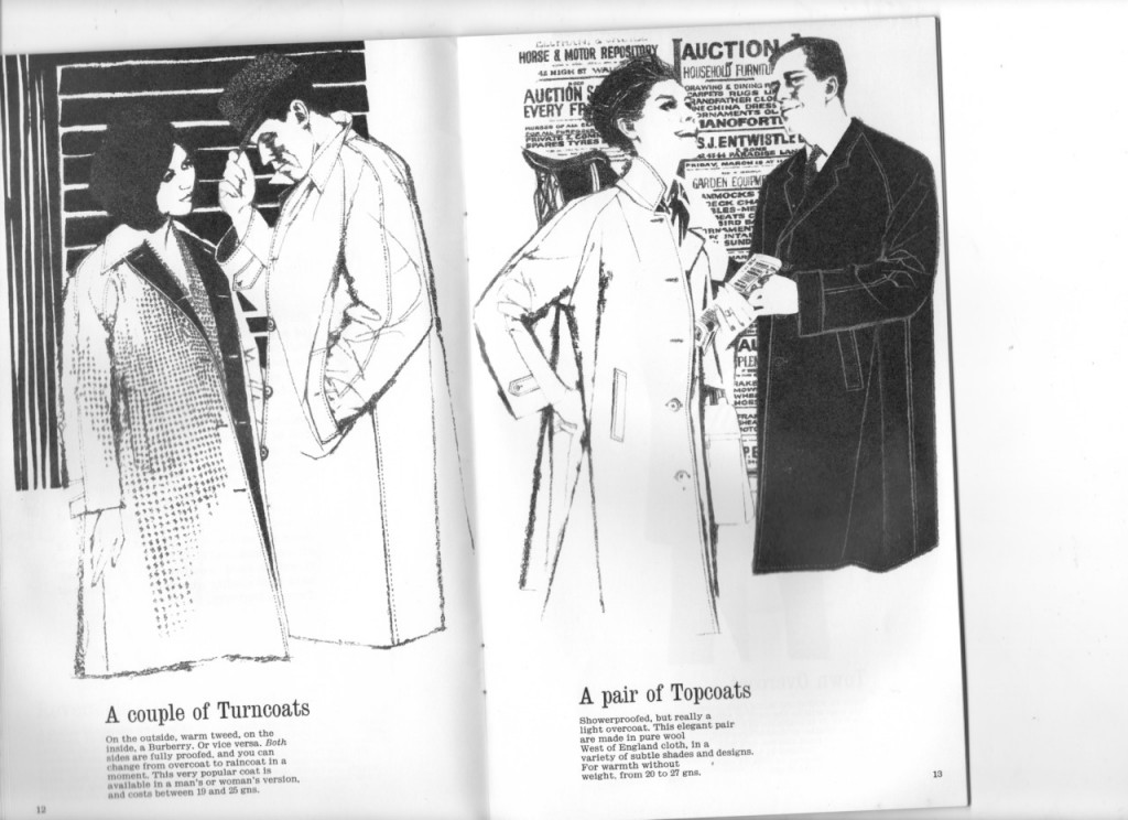
A debut book by Louise Roe, the read is one that is intended to give women self-confidence; with tips on how to dress for a first date, what to wear to a job interview, how to apply the perfect cat-eye and much more. Tracy Turnbull leading illustrations are used throughout the book, catching those many moments in a woman's life. The book is out now.
One of Phosphor Art’s latest illustrators was noticed by Mark Reddy and Sarah Pascoe at BBH recently. illustrated portraits of some of the BBH team in his signature style for a special awards dinner.
Each team member’s personality shines through in the quirky illustrations which reflect their nicknames through props and clothing. Everybody was very happy with the result – so much so that BBH commissioned two more portraits even after the event had happened.
Every year, The National Portrait Gallery runs the BP National Portrait awards – inviting the world to take part in a prestigious & respected competition that more often than not contributes a global portfolio of stunning portraiture.
Alongside this amazing exhibition of hand-picked portraits, families are invited to take part in their family trail to amuse children and get them interested/understanding art and portraits. Part of the family trail is made up of illustrated vinyl stickers & a pamphlet type worksheet for kids to draw in, complete with competitions. Each year, a noted creative is chosen to illustrate this family trail – previous illustrators for this project have been Jenni Desmond and Salvatore Rubbino.
It comes to no surprise to us therefore, that our very own Yasmeen Ismail was interviewed and chosen to illustrate the characters for the family trail 2015!
Yasmeen’s impressive publishing portfolio, her inky/delicate style and vivid use of delectable colour have earned her this honoured position at The National Portrait Gallery.
Congratulations to Yasmeen for another illustration triumph!
The BP portrait awards are in their 36th year and will run between the 18th of June to the 20th of September.
Arena Illustration welcomes Serena Malyon, a talented young Canadian illustrator to our list. Serena's beautiful and lyrical line, gorgeous colour palette and engaging narratives are sure to turn heads. We really hope she will find a good partnership with a publisher who will nurture her unique talent and use her enchanting images to enrich their books. She was named as one of the fantasy art collective, Muddy Colors 2014 Rising Stars and her work has appeared in Spectrum and Communication Arts.
We love Carrie May’s cover art for the paperback and ebook editions of 'A Seaside Affair’. Carrie worked with the design team at Harper Collins to create a new look for Fern Britton’s best selling title. Carrie used her trademark textures and experimented with a bolder colour palette to create this charming artwork. 'A Good Catch' Fern's latest release is out at the end of the month, featuring another one of Carrie's stunning artworks.
James Taylor's spectacular photo illustration for the cover of Eleven Magazine.
"Welcome to Eleven, a new bi-monthly interactive digital football magazine app, showcasing 11 editorials by respected expert global football writers and authors.
We believe that with the great exposure to the game across the world, serious football fans are looking for exclusive, thoughtful, long-form articles, but with a more personal touch. With the immediacy afforded by an instantly downloadable app and touch-screen interaction, Eleven aims to deliver informative, intelligent, passionate writing, put together in a stylish and inclusive way.
Also throw into the mix, the ambition to find and develop new talented writers, photographers and illustrators. We want to provide a sounding board for an online community through our website and social media platforms; to hear Your Voice and help others to hear it too.
The main features will be insightful, thought-provoking, full of analysis and nostalgia. At the front of the mag we will carry opinion pieces by Musa Okwonga and Jonathan Wilson. The first of four regular sections, Match will take the form of a preview looking at the world’s tastiest derby games from a historical perspective. We look at the managers and players to watch and then review the latest game.
James's design was for the alcove space where he has represented a selection of the well-known theatres in the area. He says "The focus of the West End 'Theatreland' is of course the shows themselves, however the theatre buildings are often iconic and beautifully grand venues." Using acrylic pens and emulsion, James has drawn St Martin’s Theatre, Lyceum Theatre, Queen’s Theatre, Victoria Palace Theatre, Novello Theatre, London Palladium and Palace Theatre, along with characters from some well-known productions. He was also asked to produce a decorative mural for the George Bernard Shaw quote wall, which includes some theatre inspired elements, all this was completed over a period of six days.
Late last year had the chance to illustrate a page of stamps for Terry Pratchett’s Discworld Emporium. For those who don’t know Discworld is a series of 40 books written by Pratchett, based on the fictional Discworld – a flat planet sitting on the backs of four elephants which ride through space on the back of a giant tortoise (of course)…
The stamps feature Sam Vimes – the chief of police of Ankh-Morpock, the biggest city on the Discworld. Although Vimes is a much-loved character from the series he had never before been featured on his own stamp. Discworld stamps are fast becoming collector’s items and have been picked up by The British Museum in the past, so we hope the Sam Vimes stamp will prove as popular as the rest.
Bill was honoured to be included in this strange world and the resulting stamp looks great. The Phosphor team were saddened to hear the news of Terry Pratchett’s death last month and wish to send their condolences to Terry’s family and all at the Discworld Emporium.
The stamp will be available to buy in two batches on April 11th from the Discworld Emporium Website -
We’ve been working on our new stationery here at HF towers, something that’s always a tricky thing to do – stock samples, pantone chips, brand identity. It’s a dizzying task. It all began with some clever illustrated portraits of HF staff Tom, Jon and Stuart, created by Jean Jullien. These were then handed over to master-of-design George Bradshaw, who worked them into business card designs, which utilises the Circular typeface by Lineto. GF Smith Colorplan Cool Grey was the stock of choice, which was printed by the good folk at Darwin Press. Patrick Bateman eat your heart out.
Kristyna created animal and kids characters and twenty three different scenes for their catalogue along with additional elements for their Look Book, to showcase their children's accessories. Using photographs of all the clothing and accessories, she developed each of the kid's characters around them, giving Gucci a variety of poses for other uses in the Look Book. The result is a fresh and vibrant series of spreads that beautifully display the clothes, hats, sunglasses, bags, shoes and belts in the range.