The SAA are very pleased to be supporting the World Illustration Awards by sponsoring The SAA Agents Award for New Talent.

Mark Long for GR8 People.


Mark Long was called upon for his services by the very brilliant agency NB Studio (unrelated to NB Illustration) to work with the global recruitment specialists GR8 People for there branding, website and general communications.


NB Studio always have fabulous briefs giving the illustrator the right amount of artistic licence along with first class art direction that brings the best out of the talents of whoever they work with, allowing them to get under the skin of the client and own the artworks they create.


Mark Long is represented by NB Illustration

Jean Jullien, Majestic Wines

We've had quite a boozy month here at HF, with Tom Haugomat's Stanley Brewing Beer illustrations, now we're proud to show off Jean Jullien's latest work for Majestic Wines. Jean created 10 stand alone images, without any name, logo or type, to buck the trend of conventional wine labels and to make them fun and playful.

(more…)

Tom Haugomat, Stanley Park Brewing

We're so excited to reveal Tom Haugomat's amazing new work for Stanley Park Brewing. Tom created a series of new illustrations for the Vancouver based craft brewers as part of a new identity created by Will Creative Inc.

(more…)

Steward Easton label and mural for twisted barrel ale

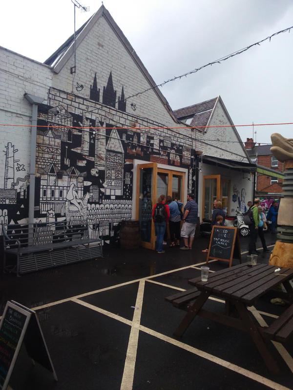
The mural on the wall is on the outside of the brewery Twisted Barrel Ale. It's a new brewery which has just opened up in Coventry. The imagery on the wall was drawn from an open brief- they wanted a representation of Coventry. Stewart chose to use the story of Lady Godiva and Peeping Tom to depict for the wall painting.

CIFd_A4WsAAQFhM

Prior to the bombing during the blitz,  Coventry was a real pretty city with a vast amount of Tudor buildings. After the war the council pulled what was left down with a view of rebuilding it and making it a modern town -  but it was never finished.  As a reference to this Stewart have drawn lots of tudor style buildings based on the remaining ones in Coventry.
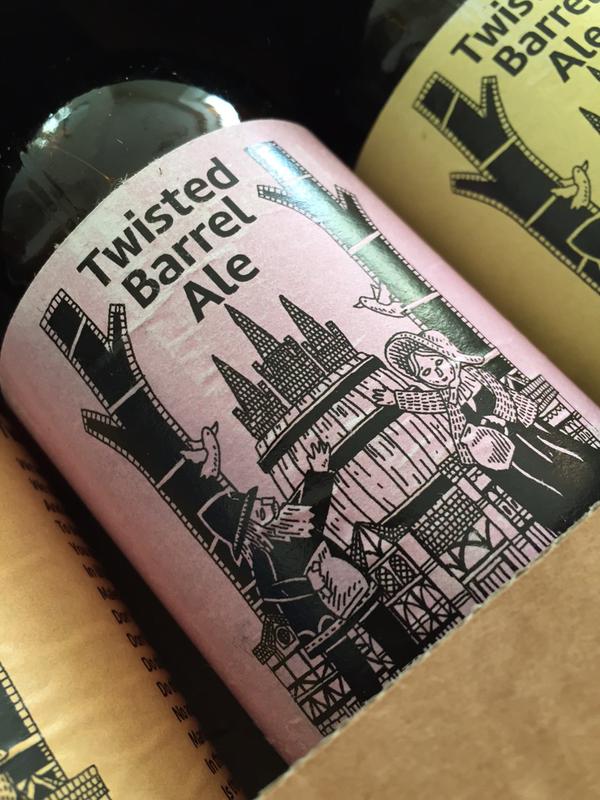
The labels design was once again an open brief, though  Stewart needed to have connections with Coventry.

CH9wTsWWEAAi3Fk

On the label design you will see the Tudor buildings, Coventry's three spires, doves (as a reference to Coventry being a city of peace and reconciliation). I drew a lad and a lass in celebration of the tag line 'more folk than punk' from the brewery.

For more of Stewart's lovely work please go to the Artist Partners website.

Steward Easton is represented by Artist Partners


Pimm’s bottle artwork by Paul Thurlby

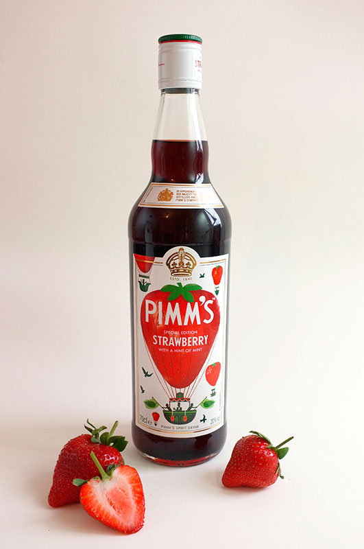
With the launch of a special edition of Pimm’s this summer, Mother London asked Paul Thurlby to create artwork for the new bottle.

HF 2

The flavour in question was Strawberry (with a hint of mint), which along with the British countryside, Paul used as his inspiration for his illustrations. Twenty signed prints were also created for the campaign, which will be given away to promote the launch.

HF 1

Paul Thurlby is represented by Handsome Frank

Handsome Frank branding & stationery

We’ve been working on our new stationery here at HF towers, something that’s always a tricky thing to do – stock samples, pantone chips, brand identity. It’s a dizzying task. It all began with some clever illustrated portraits of HF staff Tom, Jon and Stuart, created by Jean Jullien. These were then handed over to master-of-design George Bradshaw, who worked them into business card designs, which utilises the Circular typeface by Lineto. GF Smith Colorplan Cool Grey was the stock of choice, which was printed by the good folk at Darwin Press. Patrick Bateman eat your heart out.

hf4     HF 1

 HF 2     HF3

Jean Jullien is represented by Handsome Frank

Join the Society of Artist’s agents

but before you do, please read our criteria for joining here